Your Amazon Images Are a Conversion Engine, Not a Gallery
Your Amazon FBA product photography is not a creative expense. It is a strategic asset with a direct, measurable impact on your click-through rate (CTR), conversion rate (CVR), and PPC efficiency.
On a mobile-first platform, images make the sale. Copy justifies the purchase decision a shopper already made with their eyes. This makes conversion-focused images the single most powerful lever you can pull to drive revenue.
Images Are Your Most Powerful Sales Lever
Most sellers treat listing images like a box to check. They get a few clean shots on a pure white background, add a generic lifestyle photo, and call it a day. This is a costly mistake.
Those seven image slots are the most valuable real estate on your product detail page. Underutilizing them is like paying for a billboard and leaving it blank.

This guide is a strategic framework for engineering a visual narrative that makes your product the only logical choice. We are shifting the mindset from merely "showing the product" to visually solving a customer's problem before they read a single bullet point.
The Direct Link Between Visuals and Metrics
Every image must have a job. One image is designed to stop the scroll in search results. Another exists to showcase a key benefit. A third is engineered to dismantle a common buying objection.
When you assign a specific, conversion-focused goal to each visual asset, it creates a powerful ripple effect across your entire Amazon business.
- Improved Click-Through Rate (CTR): A superior hero image grabs attention on a crowded search results page, earning you more clicks than competitors, even at a similar price.
- Higher Conversion Rate (CVR): A strategic image set answers questions and builds trust instantly, turning browsers into buyers and boosting your unit session percentage.
- Increased PPC Efficiency: When your images convert traffic more effectively, your Advertising Cost of Sale (ACoS) goes down. You generate more sales from the same ad spend.
The core principle is simple: Your images are not a creative expense; they are a direct investment in your conversion rate. A well-executed visual strategy is a force multiplier, improving the performance of every other activity from organic ranking to paid advertising.
The difference between a seven-figure brand and one that stalls often comes down to this understanding. While competitors use generic stock photos or weak, text-heavy infographics, the most successful sellers deploy a research-driven visual arsenal.
You can learn more about the team behind this strategic approach and our philosophy on our About Us page. This process isn’t about making pretty pictures; it’s about building an undeniable case for your product, one image at a time.
The Research Blueprint for High-Converting Images
High-performing Amazon FBA product photography is engineered, not guessed.
While your competitors pick out nice backdrops, you should be digging into data. The most potent visual strategies are born from a systematic research process that gives you an unfair advantage before a single photo is taken. This isn't about creativity; it's about reverse-engineering a sale.
The process starts with deep competitor analysis. Don’t just glance at their hero image. Scrutinize the entire seven-image carousel of the top three to five sellers in your niche. Your goal is to pinpoint their visual weaknesses and find the gaps in their storytelling.
Are they using blurry lifestyle photos? Is their text-heavy infographic unreadable on mobile? Are they failing to show the product's scale or a key feature in action? Every mistake they make is an opportunity for you to create a superior visual argument and steal market share.
Mine Customer Reviews for Visual Gold
The single most valuable source of intel for your Amazon photography is your competitors' customer reviews—specifically the two, three, and four-star reviews. These are a goldmine of objections, pain points, and unanswered questions that their images failed to address.
Systematically pull out the exact language buyers use. Look for recurring themes.
- "I thought it would be bigger/smaller..." This is a direct signal to include a clear scale shot, perhaps showing the product next to a common object or held in a hand.
- "It was difficult to assemble." That's your command to create an infographic or action shot that visually demonstrates how simple assembly is.
- "I wasn't sure if it would work for [specific use case]." This is your cue to create a lifestyle image showing the product being used successfully in that exact scenario.
This "review mining" process directly feeds your shot list. Each of your seven images must be engineered to preemptively answer a question or crush an objection you found in your research. Your image carousel becomes a visual FAQ that builds trust and makes it easier for shoppers to click "Add to Cart." For more strategies like this, check out our blog.
You are not just creating images; you are creating visual answers. When a shopper sees your listing, they should feel understood because your photos directly address their concerns, often before they can articulate them.
This data-first approach guarantees every image slot serves a strategic, conversion-focused purpose. It is a far more effective method than creating visuals that just "look good."
While strategy is key, quality still matters. According to this comprehensive study, high-quality, strategic images can lift conversions by as much as 60%—which directly signals to Amazon’s A9 algorithm that your product is a winner.
Engineering the Perfect 7-Image Carousel
Your seven image slots are the most valuable real estate on your listing. Wasting even one is a critical error.
Most sellers treat the image block as a gallery. You must treat it as a strategic, seven-step sales pitch designed to walk a shopper from awareness to purchase. It’s not about showing the product; it's about engineering a visual story where each image has a specific job.
The entire carousel must work as a single, cohesive system. Each slide builds on the last, systematically dismantling objections and building desire. This starts with a simple, repeatable research process.
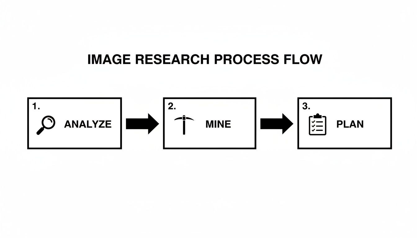
This workflow is the foundation of every high-converting image set. Analyze competitors, mine customer reviews for pain points, and then—and only then—plan your shots. It ensures your photography budget is spent solving real customer problems, not just creating pretty pictures.
The Anatomy of a High-Impact Image Set
Let's break down the role of each image. While the exact order can be tested, this structure is a battle-tested blueprint for grabbing attention and driving conversions, especially on mobile where every pixel counts.
We call this "The Strategic 7." Each image has a distinct, non-negotiable role.
| Image Slot | Image Type | Strategic Purpose |
|---|---|---|
| 1 | Hero | Win the click. Pure white background, product fills the frame, instantly recognizable. |
| 2 | Lifestyle Context | Build aspiration. Show the product in its ideal environment, solving the customer's problem. |
| 3 | Key Benefit Infographic | Communicate value. Visually highlight the single biggest benefit that addresses a core pain point. |
| 4 | In-Action / Social Proof | Build trust. Show a real person successfully and joyfully using the product. |
| 5 | Objection-Handling Infographic | Remove hesitation. Directly tackle the most common reason for doubt (size, durability, setup). |
| 6 | Comparison Chart | Create superiority. Position your product as the obvious choice against generic competitors. |
| 7 | "What's in the Box" / Scale | Set expectations. Clearly show everything included to prevent confusion and disappointment. |
By assigning a clear job to each image, you create a visual sales argument far more powerful than any wall of text.
Your image carousel must work harder than any other element on your page. It needs to tell a complete story, answer every major question, and build overwhelming value before a customer ever reads your bullet points.
Let's dig into the specifics for each slot.
Image 1: The Hero Image This is your single most important asset. Its only job is to stop the scroll and win the click in a sea of competitors. It must be on a pure white background (RGB 255, 255, 255), fill at least 85% of the frame, and be instantly clear at thumbnail size. Forget creativity; focus on compliance, clarity, and stopping power.
Image 2: The Primary Lifestyle Context Shot Immediately after the hero, connect the product to the buyer's life. Show it in its ideal environment. This shot helps them visualize the outcome they're buying. This cannot be a generic stock photo; it must be a staged scene that mirrors the customer’s aspirations, based directly on your review mining.
Image 3: The Key Benefit Infographic Use this slot to hammer home the single most important benefit that solves the customer’s biggest problem. Use minimal, large-font text and clean pointers. The goal is instant comprehension on a tiny screen, not a technical manual.
Image 4: The Social Proof or "In-Action" Shot Show the product being used effectively—and happily. This image builds immense trust and demonstrates tangible value. If you have multiple use cases, pick the one that directly answers the most common "Will this work for me?" question you found in your research.
Image 5: The Objection-Handling Infographic This is where you proactively tackle the biggest reason for hesitation. Is it durability? Size concerns? Complexity? Create a simple visual that crushes that specific concern. A durability test, a 3-step setup guide, or a close-up on a key material is highly effective.
Image 6: The Comparison Chart This is your competitive knockout punch. Create a clean, simple chart comparing your product's key features against a generic competitor. Use large checkmarks and X’s to unequivocally position your product as the superior choice. This short-circuits the shopper's need to click away and compare.
Image 7: The "What's in the Box" or Scale Shot End the carousel by setting crystal-clear expectations. An image showing exactly what the customer will receive eliminates post-purchase frustration and negative reviews. Alternatively, a clear scale shot—the product next to a common object or held in a hand—manages expectations about size.
Executing the Photoshoot and Post-Production
You’ve done the research and mapped your shot list. Now strategy meets execution.
Many sellers believe a high-end camera or fancy studio separates winners from losers. It doesn't. The real goal is clarity and conversion, not winning a photography award.
For the shoot itself, a simple two-light setup with softboxes—a key light and a fill light—is usually sufficient to get clean, evenly lit shots without harsh shadows. Your priority is to capture crisp, high-resolution source files. Shooting in RAW format provides the most data to work with during editing.

For sellers trying to stretch a budget, there are plenty of affordable product photography tips that will get you high-quality visuals without breaking the bank.
Mastering Post-Production and Infographics
The magic happens in post-production. This is where you transform raw images into strategic assets that sell. It’s not just tweaking colors; it’s about engineering visual communication that works on a five-inch screen.
Your main job is to create a dead-simple visual hierarchy for your infographics. Many sellers cram images with tiny text and distracting designs. On a mobile device, this becomes an unreadable mess that shoppers swipe past.
Here's a practical workflow:
- Color Correction & Retouching: First, ensure product colors are accurate and consistent. Remove any dust or scratches.
- Hero Image Cutout: Your main image must be isolated on a pure white background (RGB 255, 255, 255). No exceptions.
- Infographic Design: Use big, bold fonts and short text. One powerful phrase beats a paragraph. Use arrows and icons to guide the eye and communicate a benefit instantly.
- Mobile-First Test: Before exporting, shrink your images to thumbnail size. If you can’t read the text or understand the point, it’s too complicated. Simplify it.
A great infographic doesn't just list features. It visually proves a benefit and crushes a specific objection. If it takes more than three seconds to understand, it has failed.
Amazon's Technical Specifications
Finally, you must play by Amazon's rules. Their technical requirements are strict, and failure to comply will get your listing suppressed.
This is where many DIY attempts fall apart. Sellers struggle with the 85% frame fill rule or achieving a true white background, which leads to rejection.
Ensure your final files check these boxes:
- Format: JPEG is standard.
- Resolution: At least 1000 pixels on the longest side to enable zoom. We recommend 2000px for future-proofing.
- Color Mode: sRGB, the web standard.
Getting this wrong isn't a small mistake—it can make your entire listing invisible. If handling these details is a headache, you can get a complete, compliant image set created for you and skip the guesswork.
How to Test and Optimize Your Images for Higher CVR
Launching your new, research-driven images isn’t the finish line. It’s the starting gun.
Treating your Amazon product photography as a one-and-done task is a mistake that leaves money on the table. Your images are dynamic assets. Top sellers are constantly testing and refining them to squeeze out every last percentage point of conversion.
The most direct way to do this is with Amazon's "Manage Your Experiments" tool.
This feature lets you run a true A/B split test on your main hero image. This isn't guesswork; it's the scientific method for determining which visual drives the highest click-through rate (CTR) from the search results page.
You can test a shot from a slightly different angle, a tweak in lighting, or a different composition. Amazon shows each version to a slice of shoppers over several weeks, then declares a statistically significant winner based on hard data. An image that lifts your CTR by even 1-2% can mean thousands of extra sessions—and sales—over a year.
Beyond the A/B Test
While split testing your main image is critical for driving traffic, you must also measure how your entire seven-image set impacts your conversion rate (CVR). This requires a dive into your Business Reports in Seller Central.
The key metric is Unit Session Percentage. This number tells you what percentage of visitors to your listing become buyers.
After launching a new image set, monitor this metric for the next 30 days.
- Did it go up? Excellent. Your new visuals are doing their job more effectively.
- Did it stay flat or go down? This is a red flag. One or more images may be causing confusion or failing to handle a key objection, signaling it's time for a revision.
Your image set is a living system. Continuous iteration based on performance data is what separates seven-figure sellers from everyone else. The goal is a feedback loop where shopper behavior dictates your next adjustment.
To know if your numbers are good, you need a benchmark. Understanding the average ecommerce conversion rate helps you set realistic goals and see the real impact of your changes. Don't settle for "good enough"—use data to turn your images into your most powerful and consistently improving sales tool.
Common Questions from Experienced Sellers
Even veteran sellers get stuck on image strategy. Amazon is a moving target, competitors are always raising the bar, and what worked last year might be costing you sales today.
Here are the most common questions from sellers looking for an edge.
How Often Should I Refresh My Amazon Product Images?
Thinking you can "set and forget" your images is a recipe for a slow sales decline. As a rule, plan on a full image refresh every 12 to 18 months.
But that's just a baseline. Certain triggers demand an immediate update:
- A sudden performance drop. If your CVR or session rate tanks and you haven't changed your price or ad strategy, your images have likely gone stale.
- A competitor raises the bar. When a rival launches a killer new image set that makes yours look dated, you must counter—fast.
- You uncover new customer insights. Mining your latest reviews may reveal a pain point or benefit you hadn't considered. That needs to be in your images.
The goal isn't just to look new. It's to stay sharp and ensure your visual message is the most persuasive one in your category. Always A/B test a new hero image before rolling out the full set.
Should I Use Lifestyle Photos or Infographics?
This is a false choice. It’s not an either/or question. You need both. They perform two different, critical jobs.
Lifestyle photos forge an emotional connection. They let the shopper picture your product in their own life, solving their specific problem. This makes them want it.
Infographics appeal to logic. They deliver the hard facts—dimensions, features, materials—that justify the purchase. This makes them feel smart for buying it.
A high-performing image set hooks the buyer with emotion from a lifestyle shot, then closes the deal with the rational proof of an infographic.
Can I Just Reuse My Website's Photos on Amazon?
You can, but you shouldn't. It's a fundamental misunderstanding of the platform.
Your own DTC website is a curated brand experience. You control the environment. Your photography can afford to be more artistic, subtle, or brand-heavy.
Amazon is a chaotic street market. Your product is one thumbnail in a sea of competitors screaming for attention. Your images must fight harder and communicate faster.
Your Amazon images are a self-contained sales pitch. They have seven seconds to answer every question, handle every objection, and build enough trust to get the click. This requires direct callouts and comparisons that would feel too "salesy" on your own site.
Reusing DTC photos on Amazon is a shortcut that almost always tanks your conversion rate. The marketplace demands its own visual language.
What's the Biggest Mistake Sellers Make With Their Hero Image?
The single most expensive mistake is creating a hero image that just "shows the product." Its only job is to win the click on a crowded, mobile search results page. That’s it.
This means avoiding fatal errors like poor lighting or a boring angle. Critically, your product must fill at least 85% of the frame. Anything less gets lost.
On a phone, your image is a tiny square. It has a fraction of a second to grab attention and signal quality. If your hero image is weak, your title, price, or reviews don't matter—the shopper has already scrolled past. The only thing worse is failing to A/B test it, which is the equivalent of setting cash on fire.
If you want a deeper dive into your own visuals or need help building an image set that converts, you can schedule a free consultation with our team.