High-Converting Amazon Product Images For Sellers
Your Amazon product images are either your most powerful sales asset or your biggest liability. There is no middle ground.
For established sellers, weak visuals aren't just a missed opportunity. They're a direct drain on your profits, quietly killing conversions and bloating your ad costs every single day.
Why Your Product Images Are Costing You Sales
Let's be blunt: most Amazon images fail.
They fail because sellers treat them as a logistical checkbox—something to get done—rather than the primary driver of the sale. Your copy, your A+ content, even your PPC campaigns, are all secondary. The image is what earns the click. It’s what kicks off the entire buying decision.
If your images don't do their job, nothing else you do matters.
This isn't about having "pretty" photos. It's about engineering a visual sales pitch that hits buyer psychology head-on. Every pixel needs a purpose, guiding the shopper from a casual scroll to an informed "Add to Cart."
The High Cost of "Good Enough"
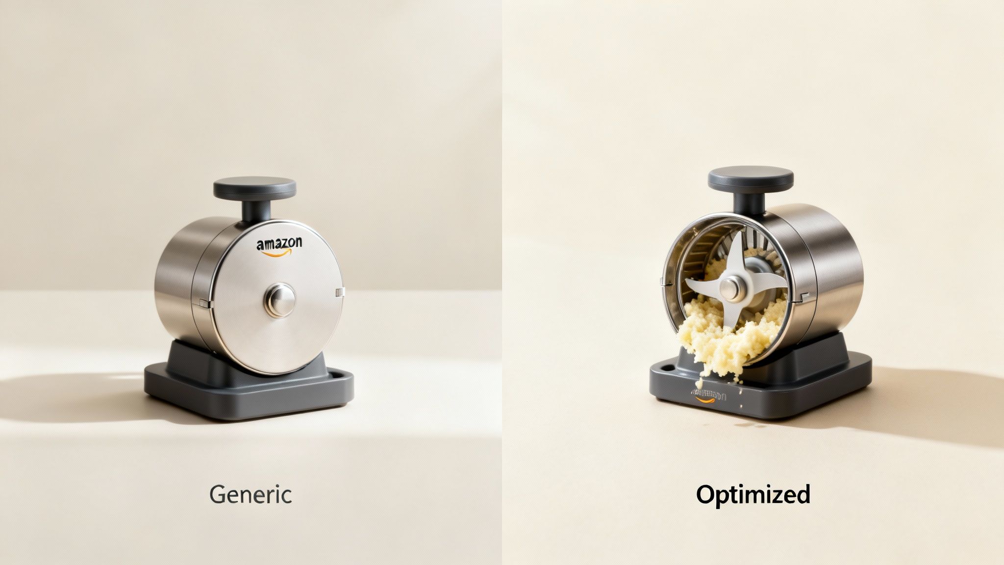
Generic, uninspired visuals create a waterfall of problems that torpedo your bottom line. They aren't a neutral placeholder; they are an active liability.
The most common mistakes sellers make are:
- Ignoring Buyer Objections: Failing to use images to answer questions like, "Is it durable?" "Is it easy to use?" or "Will it actually fit in my space?"
- Forgetting Mobile: Using tiny fonts and cluttered infographics that are completely unreadable on a smartphone, where most of your customers are shopping.
- Using Cheesy Stock Photos: Relying on lifestyle images that feel fake and do nothing to build a real connection with your target customer.
- Lacking a Visual Path: Just throwing a jumble of features at the shopper without guiding their eye to the most important selling points.
These errors have tangible, costly consequences. A low click-through rate (CTR) from the search results tells Amazon's algorithm your listing is irrelevant, sinking your organic rank. Once they're on your page, bad images don't convert, tanking your unit session percentage and torching your ad spend.
Your images are the force multiplier for your entire Amazon strategy. They make your PPC more efficient, justify higher prices, and build the brand equity you need to dominate your category long-term. Treating them as anything less is a strategic blunder.
Shifting from Checklist to Conversion Tool
The fundamental mindset shift is moving from just "showing the product" to actively "selling the product."
Your image set is a seven-step visual story designed to dismantle purchase friction. Each image has a specific job, from grabbing attention in a crowded search result to proving your product's value and crushing any final doubts.
Understanding why your images are costing you sales is the first step. The next is to learn how to actively improve e-commerce conversion rates and turn things around. It all starts by accepting that your images aren't just decoration—they're your most critical sales tool, responsible for all the heavy lifting in a marketplace that's getting more competitive by the minute.
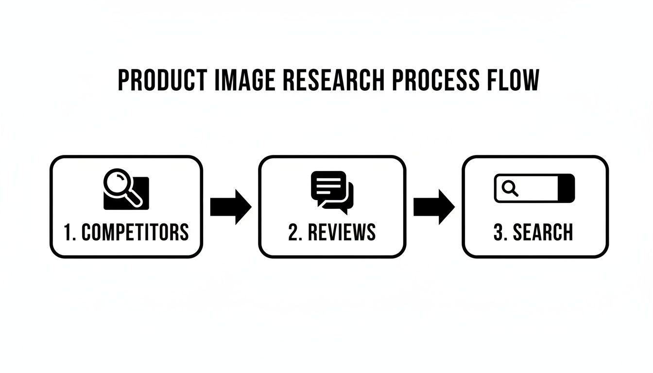
The Research Framework For Strategic Imagery
Winning listings are built on intelligence, not guesswork. Before you storyboard a single photo, you have to get inside the customer's head. The best Amazon product images for sellers aren’t just pretty pictures; they’re strategic assets designed to answer questions, crush objections, and build trust on the spot.
This research phase isn't optional. It's the entire foundation. If you skip it, you’re just creating images based on what you think buyers want, which is the fastest way to burn thousands on photography that doesn't convert.
This framework is built on three core pillars that, when used together, give you a massive advantage.
Deconstruct Your Top Competitors
First, you need to become a student of your niche. Don't just glance at the best-sellers—tear down their entire visual strategy. The goal here isn't to copy them. It's to find the patterns, messaging angles, and gaps you can exploit.
Open the top five to ten listings for your main keyword in separate tabs. Go through all seven images and start asking sharp questions:
- What's their messaging hierarchy? Look at their first few images. What's the one big benefit they're pushing? Is it durability, ease of use, premium quality, or something else?
- How do they show scale and context? Are they using models, placing the product in a real-world setting, or just slapping on dimension callouts?
- What objections are they tackling? Spot the images that scream "easy to clean," "assembles in minutes," or "fits in small spaces." These are direct answers to known customer pain points.
- Where are they weak? Are their infographics a cluttered mess on mobile? Do their lifestyle shots look like cheap, generic stock photos? Every weakness is your opportunity to look better.
This gives you a baseline for what the market already considers "good." Your job is to find the holes and do it better.
Mine Customer Reviews for Conversion Gold
Customer reviews are a direct pipeline into the buyer's brain. They are the most honest, unfiltered source for the exact words, pain points, and desired outcomes you need to show in your images.
Go through your own reviews, but more importantly, dive into the reviews of your top three competitors. Ignore the five-star ("Great product!") and one-star ("Arrived broken!") fluff. The real intelligence is buried in the two, three, and four-star reviews. This is where shoppers tell you what they almost loved, what they wished the product did, and what nearly stopped them from buying.
Look for recurring phrases. If you see multiple reviews saying, "I was worried it would be too small for my countertop," that’s your signal. You need an image with clear dimensions or one showing the product in a relatable kitchen setting. This isn't just photography; it's visual objection handling.
This process hands you the raw material for your infographic copy and lifestyle concepts. You're no longer guessing what matters to buyers—they're telling you directly. You can find more strategies for using customer feedback in our other guides. For more, check out our complete guide on listing optimization on the AZProdShots blog.
Translate Search Intent into Visual Hooks
Finally, you have to understand the why behind a customer’s search. Someone typing "waterproof hiking backpack" has a completely different motivation than someone searching for a "lightweight laptop backpack." The first person is terrified of their gear getting soaked; the second just wants comfort and portability.
Your images must instantly confirm to the shopper that they've found the solution to their specific problem. The main image has to stop the scroll, and the secondary images must match the intent of the keyword that brought them there.
This alignment is everything. If you skip this research, you're just another listing lost in a sea of similar products.
By combining competitor teardowns, review mining, and search intent analysis, you build a data-backed blueprint for your entire image stack. Every photo, every callout, and every lifestyle scene will have a specific, measurable purpose. That’s how you make sure your investment actually pays off.
Engineering a High-Conversion Image Stack
You've done the research. Now it's time to turn those customer insights into cash.
We're not just filling seven image slots here. We're engineering a visual sales pitch—a deliberate sequence that walks a shopper from "I'm just looking" to "I need this." Every single image has a job. If one slacks off, the whole system gets weaker, and your conversion rate pays the price.
Think of it like this: a shopper lands on your page. You have maybe eight seconds, max, to convince them to stick around. Your images have to do all the heavy lifting, telling a story that builds desire, answers questions, and crushes doubt before it even pops up.
Image 1: The Hero—Your Scroll-Stopper
Your main image has one job: earn the click.
It lives on the search results page, a chaotic battlefield where it's up against dozens of competitors. It has to be instantly recognizable, sharp, and compelling enough to stop a thumb mid-scroll.
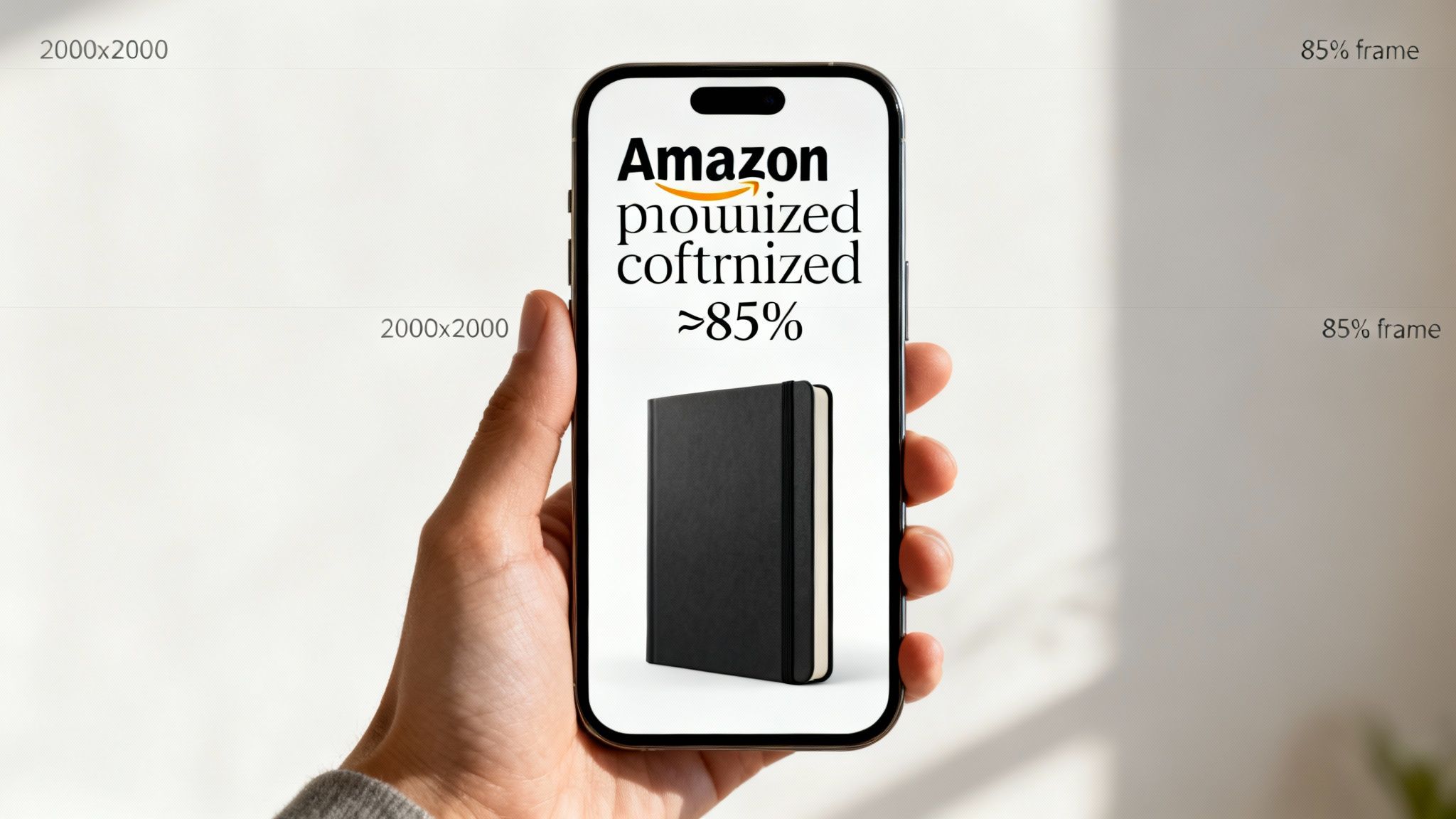
Amazon's rules are non-negotiable here. You need a pure white background (RGB 255, 255, 255), and the product must take up at least 85% of the frame. Don't even think about adding badges or text; you'll risk getting your listing suppressed. This isn't the place to get creative. It's about clarity and compliance. A clean, professional shot screams quality and gets the shopper to click for more.
The Six Secondary Images: A Visual Sales Funnel
Once the hero image gets them to your page, your next six images need to close the deal. Their job is to systematically tackle every question, objection, and motivation you found during your research.
Each slot has a specific mission.
The Seven-Image Strategic Breakdown
Every image in your listing has a specific role in moving a customer toward purchase. This table breaks down the job of each slot, from getting the initial click to sealing the deal.
| Image Slot | Primary Goal | Key Elements | Common Mistake to Avoid |
|---|---|---|---|
| Image 1: Hero | Earn the click from search results. | Clean, white background; high-res; fills 85% of frame. | Adding text, badges, or props (violates ToS). |
| Image 2: Lifestyle | Help buyer visualize the product. | Product in a realistic, aspirational context. Human element. | Using cheesy stock photos that look fake. |
| Image 3: Benefits | Answer "What's in it for me?" | Infographic with 2-3 core benefits; icons + minimal text. | Listing features instead of outcomes. |
| Image 4: Features | Provide proof for benefit claims. | Close-up shots with callouts to specific product details. | Overloading the image with too many callouts. |
| Image 5: Social Proof | Build trust and reduce risk. | A key quote from a 5-star review, certification, or award. | Using generic claims like "high quality." |
| Image 6: Objections | Crush lingering doubts. | Comparison chart, scale photo, "what's in the box" graphic. | Ignoring the top negative feedback from reviews. |
| Image 7: Closing | Summarize value and prompt action. | Brand story, guarantee, or a summary of key selling points. | Repeating information from other images. |
This structured approach is what separates amateur sellers from seven-figure brands. It’s a deliberate, psychological funnel, not a photo gallery.
You're guiding the shopper, not making them work.
Images 2 & 3 - The "Why": Start with the product in action. A killer lifestyle shot helps the buyer see it in their own life. Then, hit them with a benefit-focused infographic showing the top 2-3 solutions your product delivers. Minimal text, clear icons. This is where you answer their biggest "what's in it for me?" question.
Images 4 & 5 - The "How": Now you show them the proof. Use close-ups with callouts pointing to the specific features that make those benefits possible. You claimed it was durable? Show the reinforced stitching. Promised it was easy? Show the simple one-button control. This is also a great spot for social proof, like a killer quote from a five-star review.
Images 6 & 7 - Crushing Doubt: These last two images are for wiping out any final hesitation. A comparison chart showing why your product smokes the generic competition is pure gold here. You can also directly tackle a major pain point, like showing it fits in a tiny space or a "what's in the box" shot to set clear expectations. Your final image should be a confident summary that makes clicking "Add to Cart" feel like the most logical next step.
The Biggest Mistake I See: The "image dump." This is when a seller just uploads a random assortment of product angles and generic feature lists. It's confusing, unprofessional, and forces the buyer to do all the work. A guided, narrative-driven image sequence respects their time and leads them straight to the buy button.
Your entire image stack is a conversion machine. When you design it with this level of intent, you answer every question and objection before they can even think of it.
If you're ready to put this kind of strategic imagery to work on your listing, you can get a complete set of research-driven listing images designed to do just that.
Mastering Technical Specs And Mobile-First Design
Let’s get one thing straight: compliance isn't optional, and designing for a desktop that most of your customers don't use is a fast track to failure. Getting the technical specs right for your Amazon product images for sellers is more than just avoiding a suppressed listing—it's about making sure your images actually perform.
Mess this part up, and you're creating friction before a shopper even gets past your main image. These rules aren't just arbitrary suggestions from Amazon; they're the foundation of a listing that works. To really get this right, you have to internalize the official Amazon product image requirements. They control how your product shows up in search and on the detail page, which directly impacts whether you get the click and, ultimately, the sale.
The Non-Negotiable Technical Foundation
There's no grey area here. Amazon's core image requirements exist to create a clean, consistent shopping experience and, more importantly, to enable features buyers actually use—like the zoom function.
This is the absolute baseline you have to meet:
- Pure White Background: Your main hero image needs a background that is RGB 255,255,255. Not off-white. Not light grey. Pure white. This is what makes your product pop in a crowded search results page.
- Product Occupancy: The product itself has to take up at least 85% of the image frame. This ensures it looks substantial and clear, especially when it’s a tiny thumbnail on a phone.
- High Resolution: Images should be at least 2000x2000 pixels. This isn't a "nice to have"; it's what powers the hover-to-zoom feature that lets shoppers inspect the quality of your product up close.
Falling short on any of these can get your images rejected or your entire listing suppressed. But even if you slip by, a poor-quality image just signals a low-quality product. It's a classic rookie mistake, and one that seasoned sellers avoid like the plague.
Why Mobile-First Design Is Everything
The vast majority of Amazon shoppers are on their phones. If you’re still checking your images on a 27-inch monitor and calling it a day, you are making a massive strategic blunder.
An infographic that looks brilliant on a big screen can instantly become an unreadable, cluttered mess on a 6-inch phone. Mobile-first isn't just a trendy phrase; it's a financial necessity.
If a customer has to pinch and zoom just to read the text on your image, you've already lost. They won’t bother. They’ll just swipe over to your competitor whose images are clear and easy to digest.
The Litmus Test: Before you finalize any image, pull it up on your own smartphone. Can you read every word and understand the main benefit in three seconds? If not, it fails. Go back and redesign it until it passes this simple, yet crucial, test.
Actionable Rules for Mobile Optimization
Designing for the small screen demands discipline. You have to be ruthless about clarity. Clutter is the enemy.
- One Idea Per Image: Stop trying to cram five features into a single infographic. Give each secondary image one job to do. Focus on a single powerful benefit or feature to create a clear, unmissable focal point.
- Large, Legible Fonts: Use bold, simple, sans-serif fonts. The text has to be big enough for someone to read comfortably at arm's length without squinting. And make sure the contrast is high—dark text on a light background, or vice-versa.
- Clear Visual Hierarchy: Every image needs a hero—one dominant element that grabs the eye. Use size, color, and placement to guide the shopper to the single most important takeaway. Don't create a flat design where everything is screaming for attention at once.
Too many sellers create stunningly complex images that look amazing on a portfolio site but completely fall apart on a real customer's phone. This disconnect is a silent conversion killer. By making mobile-first your default, you ensure your visual sales pitch actually works where the majority of your customers are making their buying decisions.
Don't Guess, Test: A Practical Guide To A/B Testing Your Images
Launching a research-backed image set is a huge step forward, but the work isn't over. Complacency is where growth goes to die. If you really want to capture and dominate a category for the long haul, you have to embrace continuous, data-driven optimization.
If you aren't testing, you're just guessing.
A/B testing, also known as split testing, is how you stop guessing. It’s a dead-simple method for comparing two versions of an image to see which one performs better. For Amazon sellers, this isn't some fluffy marketing concept; it's one of the highest-leverage things you can do to compound your success.
Using Manage Your Experiments for CTR Gains
For your hero image, Amazon’s own “Manage Your Experiments” (MYE) tool is your new best friend. Its entire purpose is to help you discover which main image gets the most clicks from the search results page. A higher click-through rate (CTR) is a massive signal to the A10 algorithm that your product is relevant, which can directly lift your organic rank.
The logic is simple: test one variable at a time. This keeps your results clean and tells you exactly what made the difference.
Start with high-impact ideas that came out of your initial research. Pit them against each other:
- Angle A vs. Angle B: Does a classic 3/4 view outperform a straight-on shot?
- Packaging vs. Product: If your item is a popular gift, does showing the premium box get more clicks?
- Scale Reference: Does adding a hand next to the product to show its size improve CTR for small items?
- Color Variation: For products with multiple colors, does a bold, unexpected color outperform the standard black or white?
Let the experiment run for the recommended time, usually 4-10 weeks, until Amazon is confident in a winner. A seemingly small 5-10% lift in CTR can have a massive compounding effect on your traffic and sales over the course of a year.
Look Beyond Clicks: Analyzing Your Entire Image Stack
While MYE is perfect for the hero image, you need to look at a different metric to see if your secondary images are working. The magic number here is Unit Session Percentage—Amazon's term for conversion rate.
After you launch your new set of six secondary images, keep a close eye on this metric in your Business Reports. Did your conversion rate go up? That tells you if your new lifestyle shots, infographics, and comparison charts are actually convincing shoppers to hit "Add to Cart."
The single biggest mistake sellers make is getting impatient. They change images, copy, and price all in the same week. Then, when sales change, they have no idea what actually moved the needle. Isolate your changes so you can attribute the results correctly.
Newer AI tools are also making it possible to test visual concepts faster than ever. For example, some tools can spin up multiple lifestyle scenes from a single product photo. Some sellers are seeing an 18% higher CTR for ads using these AI-generated images, and A/B testing helps validate which concepts are worth a full photoshoot. If you want to dig deeper, you can find valuable insights on Amazon advertising statistics on adbadger.com.
Build a System for Testing
Don’t treat this like a one-off project. Build a repeatable system. All you need is a simple backlog of testing ideas, a way to prioritize them by potential impact, and the discipline to execute them one by one.
Your framework can be this simple:
- Hypothesis: "I believe adding a close-up of the fabric texture in image #4 will increase conversion by showing the quality."
- Isolate: Change only that one image.
- Define Success: "A sustained 1% lift in Unit Session Percentage over 30 days."
- Execute & Analyze: Launch the new image and watch the data.
- Document & Repeat: Record what happened and move to the next idea on your list.
This disciplined process turns your listing from a static page into a constantly improving asset. While your competitors are chasing trends and guessing, you'll be making data-backed decisions that systematically build a more profitable business.
Your Images Are Your Best Salespeople
Let’s get one thing straight: on Amazon, your images sell your product first. Your copy sells it second. Every other tweak you make to your listing is a distant third compared to the visual impression you create in the first five seconds.
Pouring money into high-quality, strategic imagery isn't just another business expense. Think of it as a high-leverage investment that acts as a force multiplier for your entire business. Better images directly improve PPC performance by driving up your click-through rate, and they boost your organic rank because more sessions convert into sales. It's also how you build the brand equity you need to stop competing on price.
Stop treating your Amazon product images for sellers as just another box to check. They are your most effective salesperson, working 24/7 to convince, educate, and convert shoppers.
This guide has walked you through the core process: research first, build a strategic story, design for mobile, and test relentlessly. While the average Amazon ad conversion rate hovers around 9.96%, the quality of your images is the single biggest factor in blowing past that benchmark. You can find more eye-opening Amazon advertising stats on adbadger.com.
Ultimately, the sellers who win on Amazon are the ones who get this. Once you start treating your images as the primary engine of your success, you'll see the results follow.
Frequently Asked Questions
Even seasoned sellers get hung up on the details when it comes to their listing images. Let's clear up some of the most common questions we hear all the time.
How Many Images Do I Actually Need For My Amazon Listing?
You need to use every single slot. Most listings give you seven, and you should treat each one like prime real estate.
Leaving an image slot empty is a massive unforced error. It’s like having a salesperson walk away from a customer mid-sentence. Each one is a chance to answer a question, crush an objection, or show off a key benefit. A full set of seven images, each with a specific job, works together to guide a shopper from a casual click to a confident purchase.
Can I Put Text Or Badges On My Main Hero Image?
No. Absolutely not. Don't even think about it.
Amazon's rules are non-negotiable on this: your main image must be a clean, professional shot of your product on a pure white background (RGB 255,255,255). No text, no logos, no "Best Seller" badges. Trying to sneak graphics onto your hero image is one of the fastest ways to get your listing suppressed by Amazon.
All your powerful text callouts, icons, and infographics belong in the other six secondary image slots. That's where they can do their heavy lifting without getting you in trouble.
What Is More Important: Lifestyle Images Or Infographics?
That's like asking if an engine is more important than the wheels—you need both to get anywhere. A high-converting listing doesn't choose between them; it uses a strategic blend of both.
They simply appeal to different parts of a buyer's brain.
- Lifestyle Images: These are all about emotion. They help shoppers picture the product in their own lives, answering the subconscious question, "How will this make me feel?"
- Infographics: These are for the logical brain. They pull out key features, specs, and benefits in a way that’s quick to scan, answering the question, "Why is this the smartest choice for me?"
The right mix isn't a 50/50 guess. It depends entirely on your product and, more importantly, on the specific questions and hesitations you discovered during your customer research. If you're struggling to figure out the right visual strategy, feel free to reach out and discuss your product with our team.