Amazon Product Images That Convert: A Data-Driven Guide
Let's be blunt: your product images are your best salespeople, and most sellers send them into battle completely unprepared.
On Amazon, your visuals aren't a creative task; they are your single most valuable conversion asset. They directly dictate the performance of every dollar spent on ads. The hard truth is that images sell first, copy sells second. Your entire funnel lives or dies based on the strength of your visual strategy.
Your Images Are Your Most Valuable Sales Asset
Too many sellers treat their listing images as a last-minute chore—a box to check before launch. This is a massive strategic blunder.
Your image block is the primary filter shoppers use to decide which products even deserve a click from a crowded search results page. Your main image determines your click-through rate (CTR). That CTR then directly influences your organic ranking and ad performance. Everything starts here.
This guide reframes the entire process. We're dismantling the lazy idea that images are a one-time setup. Instead, we'll position them as a strategic, data-driven asset that demands constant optimization. A well-engineered image set is a force multiplier—it makes PPC brutally efficient and gives you more pricing power.
The Direct Impact on Key Metrics
Every image in your carousel has a specific job, from stopping the scroll on search results to closing the sale on the product detail page. The link between high-quality imagery and the metrics that matter is not theoretical; it's absolute.
Clear, strategic photos measurably boost conversion rates. This impact snowballs across your entire operation, affecting CTR, on-page CVR, and even post-purchase metrics like return rates and review quality.
Your images are your silent, 24/7 salesperson. Failing to equip them with the right information is like sending a salesperson into a meeting without a presentation. They will not close high-value deals.
Moving From Reactive to Proactive Design
The goal is to shift from reactive image creation—which is just showing the product—to a proactive system where every image is engineered to solve a specific buyer problem.
This means each of your seven image slots must be purposefully designed to:
- Answer a pre-sale question: Show the scale of the product or demonstrate how a key feature works.
- Handle a known objection: Use an infographic to highlight durability if your 1-star reviews mention it breaks easily.
- Showcase a critical benefit: Use a lifestyle image to sell the outcome, not just the object.
When you treat your visuals as a strategic tool, you build a much more compelling case for your product than competitors who are just showing off pretty pictures.
For sellers ready to put this data-driven approach into practice, we build research-backed Amazon listing images designed to boost conversions. Because better images don't just look better; they perform better, turning more browsers into buyers and driving measurable growth.
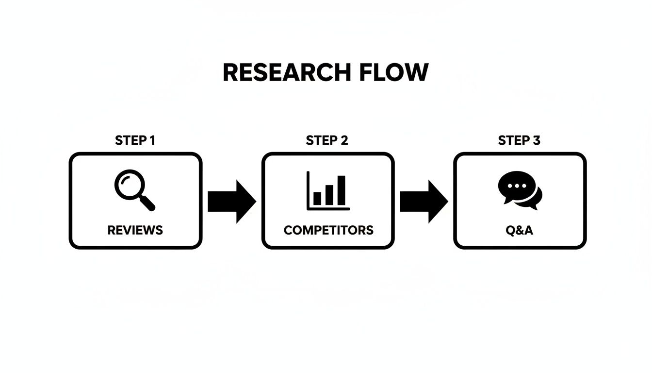
The Pre-Production Research Blueprint
High-converting Amazon images are engineered, not created. They are the end product of a deliberate research process designed to get inside the buyer’s head.
The single biggest mistake sellers make is skipping this step. They jump straight into photography with a vague shot list based on what they think buyers want or, worse, what their competitors are doing. That's a recipe for generic images that persuade no one.
The real work happens before a camera ever comes out of its bag. It’s a deep dive into the market conversation already happening around your product. Your job is to map out the exact questions, doubts, and desires shoppers have before they land on your page. This isn't about copying; it's about finding the gaps in your competitors' visual strategy and exploiting them.
Mining Customer Reviews for Conversion Gold
Your competitors' customer reviews are the most valuable data source you have. They are raw, uncensored transcripts of what real buyers love, hate, and wish they knew before clicking "buy."
Your mission is to dissect the 1, 2, and 3-star reviews of the top five sellers in your niche. Ignore the rants and look for patterns. These patterns reveal the core anxieties for your product category.
- "It was smaller than I expected." This is a direct signal to create an image showing scale, perhaps next to a common object or in someone's hand.
- "The assembly instructions were a nightmare." Your opening. An infographic showing a simple, three-step setup process becomes a powerful selling point.
- "It broke after the first use." This screams durability concerns. You need an image that highlights high-quality materials or tough construction.
While you're there, scan the 5-star reviews. What specific features do happy customers rave about? This tells you what to amplify. If they keep mentioning "the battery lasts all day," that's a key benefit that deserves its own image.
Dissecting Q&A and Competitor Listings
The "Customer questions & answers" section is another goldmine. Shoppers are telling you what information is missing from your competitors' listings. If the same question gets asked repeatedly, it’s a massive red flag that existing images and copy are failing.
Once you have a solid list of objections and must-have benefits, conduct a visual audit. Go through your top competitors' image carousels one by one.
For each competitor, ask a simple question: Which of the pain points I've identified do their images fail to address? Every unanswered question or unhandled objection is an opportunity for you to steal the conversion.
Let’s say you sell a kitchen gadget. Reviews constantly complain about how hard similar products are to clean, but no competitors show an image of their gadget being easily disassembled and washed. You just found a winning angle for one of your images. Your visuals become a direct counter-argument to the market's biggest fears.
This research-first approach transforms your images from passive photos into active sales tools. They become strategic assets that resolve doubt and build confidence, making the "Add to Cart" button the only logical next step. To learn more about Amazon selling strategies that impact your bottom line, visit our blog.
How To Strategically Design Your Seven Image Slots
Forget thinking of your seven image slots as a checklist. They are your entire sales pitch, compressed into a silent, visual narrative.
Each image has one specific, conversion-focused job. Labeling them "lifestyle" or "infographic" is surface-level. We need to go deeper. The goal is to assign each image a strategic role that walks a shopper from casual interest to a confident purchase.
Your main image earns the click. The rest must work in a logical sequence to build trust, answer questions before they're asked, and systematically crush every bit of buyer doubt. This is how you turn a browser into a buyer.
Slot 1: The Hero Image
Your main image has one job: stop the scroll and earn the click. That’s it. In a sea of search results, it must be a crystal-clear, professional photo of your product on a pure white background. It needs to pop on both desktop and, more importantly, tiny mobile screens.
This is not the place for creative flair. Its success is measured by click-through rate (CTR). Common mistakes like low-res files, bad lighting, or showing the box instead of the product are absolute conversion killers. They tank your CTR and torpedo your funnel at the start.
Slots 2-4: Building Desire and Context
You got the click. Now what? The next few images must immediately pull the shopper into the world of your product. You’re not selling an object; you're selling an outcome.
- Lifestyle Image: Show your product in a real-world, aspirational setting. This helps the buyer instantly picture themselves using it. Ditch generic stock photos and create a scene that speaks to your ideal customer.
- In-Use/Action Shot: This is where you prove it works. If it's a garlic press, show it crushing a clove. This builds confidence by showing the solution, not just telling them about it.
- Scale and Detail Shots: A huge friction point online is uncertainty. "Is it as big as I think?" "Is the material cheap?" Use an image to show scale (next to a phone or in a hand) and a macro shot that highlights quality materials or smart design details.
This first sequence is about making an emotional connection and grounding the product in reality. It’s about moving beyond a simple rendering on a white screen.
This entire process starts with a data-driven research flow that maps out what customers are saying in reviews, where competitors are failing, and what questions keep popping up.
This flow ensures every image you design is rooted in what buyers actually care about, not just what you think they do.
Slots 5-7: Overcoming Objections with Infographics
With desire established, the final images must speak to the logical part of the brain. This is where you use sharp, easy-to-scan infographics to knock down the primary objections you found during your research.
The most costly mistake sellers make with infographics is cramming them with text. A killer infographic isolates one or two key benefits, uses huge fonts and clear icons, and gets its message across in under three seconds. Especially on mobile.
Your final images are your closing argument. They provide undeniable proof of your product's value and why it's the obvious choice.
- Benefit-Driven Infographic: Find the top feature your happy customers rave about and turn it into a visual. Instead of a boring line like "5000mAh battery," show an icon of a battery with the text "All-Day Power."
- Objection-Handling Infographic: Take the most common complaint from your competitors' 1-star reviews and create an image that directly proves your product solved it. If their customers complain about flimsy plastic, show a close-up of your reinforced metal hinge.
- Comparison Chart or 'What's Included' Image: This last slot cleans up any final confusion. A simple chart comparing your product to a generic one or a clear "what's in the box" graphic sets expectations perfectly and justifies your price.
The Strategic Role of Each Amazon Image Slot
| Image Slot | Primary Role | Conversion Goal | Common Mistake to Avoid |
|---|---|---|---|
| Slot 1 | Stop the Scroll | Earn the click (CTR) | Low-resolution, poor lighting, or showing packaging. |
| Slot 2 | Aspiration | Build emotional connection | Using generic stock photos that don't match the customer. |
| Slot 3 | Demonstration | Show the product solving a problem | Being static; not showing the product in active use. |
| Slot 4 | Build Confidence | Address size/quality uncertainty | Assuming the customer knows the scale from the hero image. |
| Slot 5 | Highlight Value | Communicate the #1 benefit | Listing features instead of translating them into benefits. |
| Slot 6 | Crush Doubt | Handle a top buyer objection | Ignoring competitor weaknesses; making a generic claim. |
| Slot 7 | Provide Clarity | Set expectations, justify price | Leaving ambiguity about what's included or why you're better. |
By the time a shopper has swiped through your seventh image, there should be zero questions left. Each slot has done its job, building a powerful, cohesive argument that makes clicking "Add to Cart" feel inevitable.
Applying Visual Hierarchy and Messaging That Sells
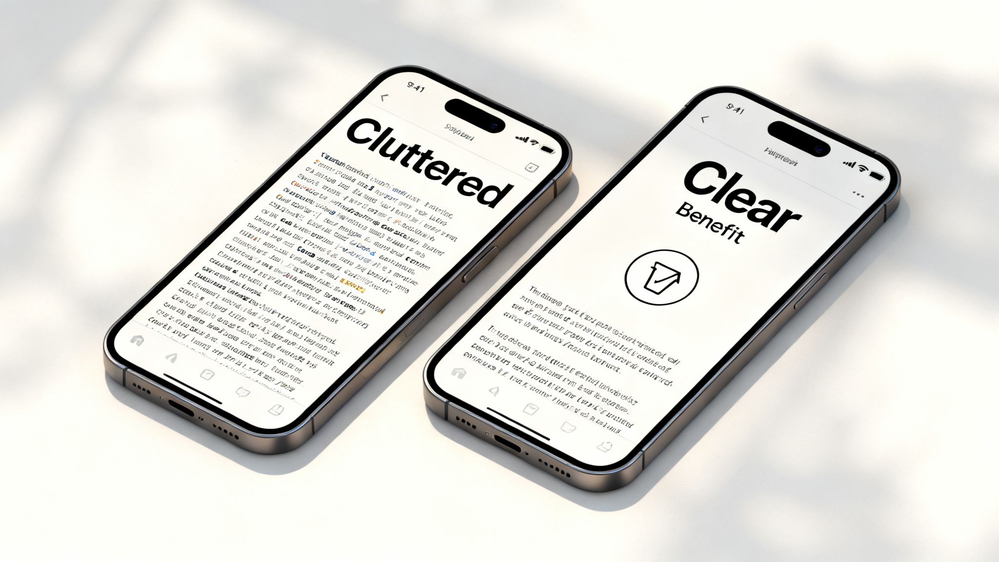
All the research in the world means nothing if the final design is a cluttered mess. This is where many sellers fall flat. They have the right ideas but cripple them with poor execution, creating infographics and lifestyle shots that confuse people.
You have less than three seconds to get your point across, especially on a cramped phone screen. To win, you must be ruthless about visual hierarchy and crystal-clear messaging. This isn't about creativity; it's about being understood instantly. The entire goal is to steer the shopper's eye to the most important information first.
Clarity Over Creativity: The Mobile-First Mandate
Mobile shoppers don't read; they scan. Your images must be built for this reality. The single biggest mistake is information overload—cramming every feature into one graphic with tiny fonts and clashing colors. It creates visual noise and friction, and it kills conversions.
Effective visual hierarchy is built on simple rules:
- Size and Scale: The most important thing—the core benefit—should be the largest thing on the image. It seems obvious, but countless sellers make their logo bigger than the one thing that will make someone buy.
- Color and Contrast: Stick to a simple, high-contrast color palette. A single bold color should be reserved for your key takeaway to make it pop.
- Negative Space: White space is your best friend. It gives your text and icons room to breathe, making the whole image feel calmer and easier to process. Clutter screams desperation.
Here's a simple rule for your infographics: if a shopper can't understand the main benefit in three seconds without zooming in, the image has failed. It's that simple.
Fonts, Icons, and Benefit-Driven Copy
Execution boils down to details. The right font, a clear icon, and sharp copy can be the difference between an image that converts and one that gets scrolled past.
Font Choice and Size: Your font needs to be bold, clean, and legible. Use sans-serif fonts like Helvetica or Montserrat—they just work. Text size is non-negotiable; it must be big enough to be read on a small phone screen held at arm's length. Always check your images on your own phone before you upload them.
Strategic Use of Icons: Icons are visual shortcuts. They break down complex features into things people recognize in a split second. Instead of writing "Waterproof up to 50 meters," use a big, clear water drop icon next to the text "Fully Waterproof." That combination of visual and text is processed faster by the brain.
Benefit, Not Feature: Finally, your copy must be relentlessly benefit-driven. Nobody cares about a "lithium-ion battery." They care about "All-Day Power." You have to translate every technical spec into a real-world outcome for the customer.
- Feature: "Made with aerospace-grade aluminum."
- Benefit: "Built to Last a Lifetime."
This is the stage where your research turns into actual amazon product images that convert. It’s how you ensure your strategic messaging is delivered with the clarity needed to convince a distracted, fast-moving shopper. The principles behind high-converting advertising banner design are incredibly relevant here; they teach you how to create visuals that don't just inform, but actively persuade and sell.
Mastering Technical Compliance And Mobile-First Design
All the research and strategy in the world won't matter if your images get suppressed or are unreadable on a phone.
Breaking Amazon's technical rules or ignoring mobile design isn't a small mistake. It's a direct path to a lower conversion rate and wasted ad spend. This is the final quality check to ensure your visuals are not only persuasive but also perfectly tuned for the platform.
Amazon's rules are non-negotiable. Break them, and your listing gets buried. The most critical rules apply to your hero image—it must have a pure white background (RGB 255, 255, 255), show only the product, and be free of any text or logos. Get this wrong, and you've failed the first and most important test. For all images, stick to JPEG, PNG, or GIF file types with an sRGB color space.
Why 2500x2500 Pixels Is The New Standard
The old advice of 1000 pixels on the longest side is dangerously outdated. Hitting the minimum is a recipe for looking average. To compete, your images need to be at least 2500x2500 pixels.
Why? The zoom function.
Shoppers zoom in to inspect quality, read fine print, and build confidence. An image that gets blurry when zoomed screams "low quality"—not just of the photo, but of the product itself. A crisp, high-resolution zoom is a massive trust signal. It shows you have nothing to hide.
If your images can't handle a deep, crystal-clear zoom, you are giving shoppers a reason to doubt your quality. That friction is all it takes to lose a sale to a competitor who invested in high-res assets.
Designing For The Thumb, Not The Mouse
Over 70% of Amazon traffic now comes from mobile devices. If you're not designing for a small, square screen, you're designing for a minority of your customers. Mobile-first isn't a buzzword; it's a survival tactic.
This means every single image, especially your infographics, has to be instantly understandable without a click or a zoom. The design must be bold and simple, built to communicate value in the fraction of a second a user takes to scroll past.
Here's what that looks like in practice:
- Bold, High-Contrast Text: Use large, clean fonts that are easy to read on a 6-inch screen. If you have to squint, it’s too small.
- Minimalism is Key: Be ruthless with your infographics. Each one should hammer home one to three core benefits, max. Clutter is the enemy of mobile conversion.
- Think in Squares: Design your images to work in a 1:1 aspect ratio. Keep the important stuff centered, not tucked into corners that might get cropped in certain mobile views.
Think of it like designing a billboard, not a brochure. The message must be immediate and powerful. Master technical compliance and a rigorous mobile-first design, and you ensure your carefully planned images are delivered with maximum clarity and persuasive punch, directly improving your ability to create Amazon product images that convert.
Stop Guessing And Start Winning With Your Images
Your Amazon images aren't just a line item on a budget. They are the engine that drives your conversion rate. The central message of this guide is that strategic, data-backed visuals are the single most powerful lever you can pull for growth.
We've thrown out the old idea of images as a commodity. Instead, we've laid out a research-first system where every image is engineered to crush an objection, answer a question, or create undeniable desire. This is about using your seven image slots to tell a cohesive story that walks a shopper from a casual click to a confident purchase.
And that story must be told on a tiny screen. Mobile-first isn't a suggestion; it's a requirement. If your message isn't crystal clear in three seconds on a phone, it has failed. This means ruthless simplicity, bold contrast, and absolute clarity are the only principles that matter.
Every other part of your business—from PPC campaigns to pricing strategy—hinges on the quality of your images. A strategic, data-driven image set isn't an expense; it's one of the highest ROI investments an Amazon seller can make.
Tracking the performance of your visuals is critical. While Amazon's tools are specific, understanding broader frameworks like measuring social media ROI can provide a solid mental model for tracking the real-world impact of your assets.
Your images are your silent, 24/7 salesperson. It’s time to stop sending them into the field unprepared and arm them with the data and strategy they need to win.
If you’re ready to put this research-first methodology to work, you can get a full set of conversion-focused images built from the ground up to outperform your competition.
Your Questions, Answered
Here are answers to common questions from sellers dialing in their images.
How Often Should I Update My Amazon Images?
Don't update on a whim. Update when you have new data.
If conversion rates dip, you receive new customer feedback, or you spot a competitor’s new visual angle that’s working, it's time for a refresh. A product update is another perfect trigger. Otherwise, an annual review is a good rule of thumb. Let data from reviews, customer questions, and split tests guide your decisions, not the calendar.
Should I Use Videos Instead Of Images?
Think of video as a powerful closer, not an opener. You absolutely still need a full set of seven killer static images. They’re what shoppers scan first and do the heavy lifting of your visual pitch.
Video has its own spot on the listing and it’s brilliant for showing your product in action. Use both. Your images stop the scroll and handle the main objections; the video can seal the deal for shoppers who are already hooked.
Get your static images right first. They have the biggest impact on your entire funnel.
What's The Biggest Mistake Sellers Make With Infographics?
Information overload. It’s the single most common and costly mistake. Sellers try to cram every feature into one graphic, and the result is a cluttered mess nobody can read on a phone. That doesn't help—it actively hurts your conversion rate.
An effective infographic isolates one to three key benefits. It uses big, high-contrast fonts and clear icons to get its message across in three seconds or less. The goal is instant understanding, not a technical manual.
Is It Better To Use Lifestyle Photos With Models?
It depends entirely on your product and audience. A model isn't a silver bullet.
Using a model makes sense if:
- Your product is personal (skincare, fitness gear).
- It's an aspirational buy (fashion, high-end accessories).
- A relatable person helps shoppers picture themselves using it.
But if your product is purely functional—a kitchen gadget or an office organizer—a clean "in-context" shot without a person is often more effective. Dig into your competitor's images and customer reviews to see what connects with your buyers.
If you need a second set of eyes on your product's unique visual strategy, feel free to reach out with any specific questions.