Your Images Are Your #1 Sales Tool. Stop Treating Them Like an Afterthought.
Let's be blunt: most private label sellers get Amazon product photography wrong. Dead wrong. They spend a fortune on pretty pictures that show the product but do nothing to sell it. It's the single biggest reason for stalled listings, wasted PPC spend, and flat-out failure.
Your images are the most powerful conversion lever you have. Period. Yet most sellers treat them as a box-ticking exercise instead of a strategic, sales-driven weapon. They operate on the flawed assumption that a clean, well-lit photo is enough. It's not.
This mindset is actively costing you money.
Why Most Amazon Product Photography Fails
When a shopper lands on your listing, they're armed with a checklist of doubts, questions, and reasons not to buy. Your images are your first—and often only—chance to disarm them. Generic studio shots showing different angles don't do that job.
The common mistake is thinking your images are a product gallery. They're not. They are a visual sales pitch. Every single one needs a clear purpose: overcome an objection, hammer home a key benefit, or build rock-solid trust. If an image doesn't do one of these things, it's wasting digital real estate.
The Shift from Showing to Selling
You must reframe how you think about your images. Stop asking, "How can I show my product?" and start asking, "How can I use this image to solve my customer's problem and close the sale?"
This isn't about art; it's about visual messaging. Each of your image slots has a specific job. It has to answer a high-stakes question in the shopper's mind before they even have a chance to read your copy.
While your competitors are busy showing off features, you’ll be using your images to systematically dismantle the exact pain points and objections that are blocking the sale. This is non-negotiable for any brand serious about growth.
The Consequences of Generic Imagery
Sticking with "good enough" photos has real, painful consequences that hit your bottom line directly. You're guaranteeing yourself:
- Lower Click-Through Rates (CTR): Your main image is your billboard in the search results. If it's weak, it gets ignored. Less traffic from the get-go.
- Reduced Conversion Rates (CVR): Unanswered questions create friction. Friction kills sales. Shoppers will just click over to a competitor who makes them feel more confident.
- Wasted Ad Spend: You’re paying for every click. If your images can't turn that expensive traffic into sales, your ACoS will bleed you dry. Poor images are a force multiplier for inefficiency.
- Increased Returns: When images don't set clear, accurate expectations, you get disappointed customers, bad reviews, and returned products.
A research-first approach to amazon product photography for private label isn't some "best practice" to consider. It is the primary lever you have for building a profitable, defensible brand on this platform.
Building a Research-First Visual Strategy
High-converting Amazon product photography for private label listings isn't born in a studio. It's engineered from data. Long before you touch a camera, you need to build a bulletproof visual strategy. This is the foundation separating seven-figure brands from sellers who are always struggling.
Most operators get this backward. They find a top competitor and copy their image style. This is a fatal mistake—it guarantees you’ll always be a follower, never a market leader.
The goal isn't to mimic what everyone else is doing. It's to find the visual gaps they've left wide open and exploit them.
Digging for Gold in Competitor Reviews
Your best intel isn't in your competitor's images; it's buried in their customer reviews. This is where you find the raw, unfiltered language of your target audience. They are telling you their exact pain points, what they truly want, and what's stopping them from buying. This process, "review mining," is non-negotiable.
Zero in on the 3- and 4-star reviews. These are from people who wanted to love the product but were let down by a specific flaw or unmet expectation.
- 1-star reviews are mostly emotional rants about shipping or defects.
- 5-star reviews are usually vague praise like "Great product!"
- 3- and 4-star reviews hold the gold: "I love the concept, but it's much smaller than I expected," or "It works well, but the instructions were impossible to understand."
These phrases are the exact objections your images need to systematically destroy.
This flow shows how you move from just showing your product to actively selling it with your images.
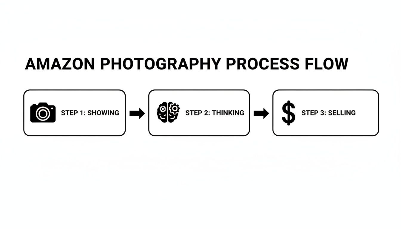
The takeaway is clear: the thinking part, driven by research, is what turns a picture into a sales tool.
Synthesizing Research into a Visual Brief
Once you've pulled out the top 5-7 objections and key desires from the reviews, turn that intel into a concrete plan. This is your Visual Brief—a simple, one-page document that becomes the blueprint for your entire photoshoot. It prevents wasted time and ensures every image has a clear, profit-driven purpose.
For each of your image slots, the brief should define:
- Image Slot: (e.g., Image 2, Image 3)
- Primary Message: The one thing this image must communicate. (e.g., "Showcases the durable, waterproof material.")
- Target Objection: The specific customer fear this image neutralizes. (e.g., "Customers worry it will fall apart.")
- Desired Emotion: What you want the shopper to feel. (e.g., "Confidence, security, reliability.")
This structured approach turns photography from a creative guess into a strategic weapon.
A Visual Brief is your insurance against generic, ineffective images. It forces you to justify every shot and align it directly with a known buyer motivation or fear. Without it, you're just guessing—and guessing is expensive.
Data backs this up. Research shows that 67% of consumers say image quality is the biggest influence on their buying decision. It's why sellers who invest in professional product photography see real returns. High-quality images can boost conversion rates by up to 60%, a lift that compounds over time because Amazon's A9 algorithm rewards listings that convert.
Conducting a Visual Competitive Analysis
With your brief in hand, you can finally look at your competitors' images through a strategic lens. Instead of just noting their style, you will deconstruct why their images are failing.
Look for the patterns and missed opportunities:
- Are they all using the same sterile, white-background infographics? Great. Stand out with authentic, in-context lifestyle shots.
- Do their images fail to show the product's actual scale? This is a common complaint and an easy win for you. Add a comparison or in-hand shot.
- Is their text-heavy infographic a mess on mobile? Create a cleaner, more visual graphic that actually works on a phone.
This research-first method is the core of effective Amazon product photography for private label brands. It ensures your images are precision-engineered tools designed to answer questions, build trust, and drive sales. For more on this, check out our other guides on the AZprodshots blog.
Executing the Core Image Types
You’ve got your Visual Brief. The research is done. Now it's time to create the assets.
This isn’t just a photoshoot. It’s about manufacturing the visual assets that will do the selling for you. Every image falls into one of three buckets—Hero, Lifestyle, or Infographic—and each one has a specific job. Amateurs just take pictures; professionals execute a visual strategy.
We're going to break down what it takes to nail each one. This separates listings that just sit there from the ones that consistently pull in sales.
Nailing the Main Hero Image
Your main image is your billboard on a crowded highway. It's the most critical visual you'll create, and its only job is to get the click. Nothing else matters. If it fails here, your entire funnel is broken before a shopper even sees your listing.
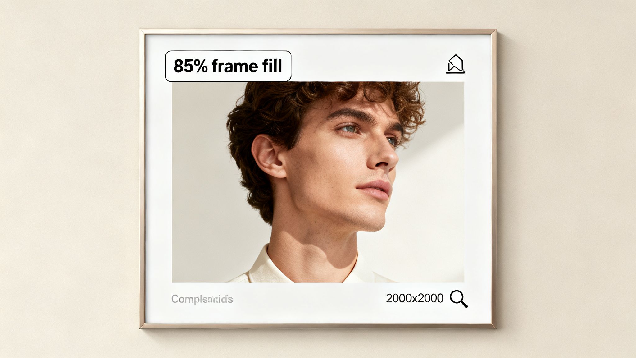
Amazon’s rules are strict: pure white background (RGB 255, 255, 255), and your product must fill at least 85% of the frame. But compliance isn't enough. Winning the click means obsessing over the details that signal quality.
- Lighting: It has to be perfect. No harsh shadows that obscure details, and no blown-out highlights that make your product look cheap. Shadows should be soft, defining the product's form.
- Sharpness: The image has to be razor-sharp, especially when a shopper zooms in. Any hint of blurriness kills trust instantly.
- Angle: Show the product from its most recognizable and feature-rich view. Don't try to be clever; be clear.
The rookie mistake is treating the hero shot like just another photo. It's a CTR machine. A tiny improvement in your click-through rate can translate to thousands of dollars in extra revenue.
Crafting Authentic Lifestyle and In-Use Images
Lifestyle images are where you stop showing the product and start selling the solution. Their job is to bridge the gap between your product on a screen and the customer’s actual life.
A shopper should see your lifestyle shot and immediately think, "That's my problem, and this is the answer."
Authenticity is everything. The days of cheesy, over-lit stock photos with grinning models are gone. Shoppers can spot a fake setup a mile away, and it vaporizes your credibility.
Your lifestyle images need to feel like a real snapshot from your ideal customer's world. The goal is to get them to visualize themselves using your product and experiencing the benefit. If you can do that, the sale is practically made.
To pull this off, create scenes that speak directly to the desires and pain points you found in your research.
- Selling a travel organizer? Show it inside a real, slightly messy suitcase—not perfectly arranged on a sterile studio floor.
- Got a durable dog toy? Get it in the jaws of a real dog in a real backyard, maybe with a little mud on it.
- Kitchen gadget? The scene needs to be a realistic kitchen counter, with a few other ingredients around, not some empty white void.
Context is key. An "in-use" shot shows how it works. A "lifestyle" shot sells the feeling or the outcome. You need both to build a connection that goes beyond a list of features.
Designing High-Impact Infographics
Think of your infographics as your closers. Their job is to communicate one key benefit in under three seconds to someone scrolling on a phone.
Less is more. A lot more.
Your review mining already told you what shoppers care about. Pick one—and only one—key message for each infographic. This could be a critical dimension, a specific material that makes it better, or a feature that solves a common complaint.
Use a clear visual hierarchy to guide the shopper's eye exactly where you want it to go.
- Start with the Visual: Use a pointer, a zoom-in circle, or an icon to draw immediate attention to a specific part of the product.
- Add a Benefit-Driven Headline: A short, bold headline spells out the benefit, like "100% Waterproof Seal."
- Use Minimal Sub-Text: If you must add a spec, keep it tiny (e.g., "IPX7 Rated").
The most common mistake sellers make is clutter. They cram five icons and a paragraph of text onto one image, creating visual noise that shoppers just scroll past. An effective infographic is clean, direct, and answers a question before the customer even has to think about it.
Navigating Amazon's Technical Image Requirements
You can spend weeks on research and perfect photography, but if your images get suppressed, none of it matters.
Technical compliance isn't just a box to check—it's the foundation of your visual strategy. Ignoring these rules is a rookie mistake that can kill a launch before it starts. The rules for your main image are especially strict: it must be on a pure white background (RGB 255, 255, 255) and the product has to fill at least 85% of the frame. Any wiggle room is asking for trouble.
Beyond the Basics: Specs That Actually Convert
Meeting the minimums just keeps you in the game. Winning requires more. The most critical technical spec top sellers leverage is image resolution, specifically for enabling Amazon's zoom function.
Amazon requires images to be at least 1,000 pixels on the longest side to activate zoom. But hitting this minimum is a massive strategic error. When shoppers can't zoom in to inspect fabric texture, build quality, or fine details, their trust evaporates.
Uploading images smaller than 2000x2000 pixels is like willingly fighting with one hand tied behind your back. You're giving up a key conversion tool that your competitors are absolutely using against you. A high-res zoom builds confidence and helps justify a premium price.
The real competitive standard for Amazon product photography for private label sellers is now 3,000 x 3,000 pixels. This delivers a crisp, clean zoom on any device, from a tiny phone screen to a desktop monitor. It signals quality and transparency, answering the shopper's unspoken question: "What are they hiding?"
Amazon Image Specification Checklist
| Specification | Amazon Minimum Requirement | Competitive Best Practice |
|---|---|---|
| Image Resolution | 1,000px on the longest side | 3,000 x 3,000 pixels |
| Main Image Background | Pure white background | Pure white (RGB 255, 255, 255) |
| Main Image Content | Product only | Product only, no text/logos |
| Product-to-Frame Ratio | Product fills at least 85% | Product fills 85-90% |
| File Format | JPEG, TIFF, PNG, GIF | JPEG (for best quality/size ratio) |
| Color Mode | sRGB or CMYK | sRGB (for web consistency) |
Following the "Competitive Best Practice" column is non-negotiable.
Common Compliance Mistakes (And How to Dodge Them)
Even veteran sellers get tripped up by small details that trigger suppression. These mistakes almost always happen during a rushed upload process.
Watch out for these common failures:
- File Naming Chaos: Amazon suggests naming files with the product ID (ASIN, UPC), a variant code, and the file extension (e.g., B00EXAMPLE.MAIN.JPG). While not always a deal-breaker, messy naming causes upload errors and makes managing assets a headache.
- Wrong Color Mode: Your images must be in sRGB or CMYK. Uploading in another profile can cause color shifts on the live listing, making your product look different and inviting negative reviews.
- Junk on the Main Image: Your main "hero" image must be sterile. Just the product, on white. Any extra logos, badges ("Made in USA"), or promotional text is a direct violation that will get the image rejected.
On a related note, it’s also smart to optimize images for SEO by managing file size. This can improve your listing's load speed, a subtle but important part of the customer experience.
Your Final Pre-Upload Check
To avoid costly suppressions, run every image through a final technical check before it goes live. This isn't about art—it's a simple pass/fail gut check.
Your list should confirm:
- Format: Are all files JPEG? (JPEG is best).
- Resolution: Is every image at least 2000x2000 pixels? (Aim for 3000x3000).
- Main Image Background: Is it pure white (RGB 255,255,255)? Check it with a color picker.
- Main Image Content: Does it show only the product? No props, no text, no logos.
- Frame Fill: Does the product take up at least 85% of the space in the main image?
Make this final check a non-negotiable step. Don't let a simple technical oversight sink the hard work you put into your visual strategy.
Testing and Optimizing Images for Conversion
Getting your new image set live isn’t the finish line. It’s the starting gun.
Your initial research-backed photography is a strong hypothesis, but only real-world data can prove it right. This is where you pull away from the sellers who "set it and forget it" and start the real work of optimization.
Amazon gives you a free, powerful tool for this: Manage Your Experiments. Ignoring it is leaving money on the table. It lets you systematically A/B test your main image to find out—not guess—which version drives more clicks and sales.
A/B Testing Your Main Image
The main hero image is the single biggest lever you can pull to improve your listing's performance from the search results page. A small lift in your Click-Through Rate (CTR) here snowballs into major gains in traffic, sales, and organic rank.
The goal is to test one variable at a time. This isn’t about throwing random images into the ring; it's about testing a specific, isolated hypothesis.
- Angle Test: Does a 45-degree angle get more clicks than a straight-on shot?
- Scale Test: Does showing the product slightly smaller to reveal more packaging improve trust?
- Shadow Test: Does a subtle drop shadow give the product a more premium feel than no shadow at all?
By isolating a single change, you know exactly what caused the performance shift. That’s how you gain real market intelligence.
Interpreting the Results
Once your experiment ends, Amazon gives you the data. The trick is knowing what to look for.
- Click-Through Rate (CTR): This tells you how well your image grabs attention on a crowded search page.
- Conversion Rate (CVR): This shows if the promise of your main image matches the reality of your listing. Did the people who clicked actually buy?
- Unit Session Percentage: This is Amazon’s version of CVR and the main metric they use to declare a winner.
- Sales per Customer: This helps you see if one image attracts a higher-value buyer.
The experiment dashboard shows the probability of one version being better. Don’t make a move on anything less than a 90-95% probability. Ending a test early or acting on weak data is worse than not testing at all. Be patient. Let the numbers talk.
Creating a Continuous Feedback Loop
While the main image gets the formal A/B test, your secondary images are optimized differently. Here, the gold is in your customer feedback. Your reviews, customer questions, and return comments are a direct line into the buyer's mind.
Go through this feedback monthly. Are people asking the same question about a feature that isn't visually clear? That's your cue to create a new infographic. Are they raving about a use-case you never thought of? That’s a perfect opportunity for a new lifestyle shot.
This creates a powerful feedback loop. Your images evolve based on what real customers are saying, keeping your listing sharp.
It doesn't just stop at static images. The next level is incorporating dynamic content. Learning how to create product videos that convert can take your visual storytelling even further, answering questions in a way static images can't. This constant dedication to optimization is what keeps your Amazon product photography for private label a high-performing asset.
Conclusion: Your Images Are Your Best Salesperson
This is where it all comes together. Your Amazon product photography for private label isn't a line item on your budget; it’s a direct, tactical investment in your conversion rate. It's the final piece of the puzzle that separates sellers who thrive from those who just tread water.
Your competitors are probably still using generic, feature-dump photos. You won't be. You’re deploying a set of visual assets engineered to dismantle specific buyer doubts, solve pain points, and tap into the desires you uncovered during your research.
The Research-First Advantage
This approach transforms your images from a product gallery into a silent, 24/7 salesperson. Each image has a specific job—to walk a shopper from skeptical curiosity to a confident “Add to Cart.” By prioritizing buyer psychology and hard data over lazy assumptions, you’re building a competitive moat that’s tough for others to cross.
Stop treating your images as an afterthought. They are the single primary driver of performance on Amazon. They are your best salesperson, your most effective ad, and your strongest defense against competitors.
The final takeaway is brutally simple: on Amazon, images sell first, copy sells second. Mastering your visual strategy isn't just a "best practice"—it's the core discipline required to dominate your niche.
From Static Asset to Strategic Advantage
The real difference between a static photo and a strategic visual asset is the research and intent packed into it. Your images will now work harder for your business. They'll improve PPC efficiency, justify a higher price point, and build the kind of trust that turns one-time buyers into loyal customers.
If you're curious about the team that lives and breathes this philosophy, you can read more about our approach here.
Master your images, and you will master your market.
Frequently Asked Questions
Even with the best game plan, some questions always pop up. Here are the straight-up answers to the things private label sellers ask us most when they're dialing in their product photography.
How Many Product Images Should I Have?
The goal is to use every image slot Amazon gives you, but strategy beats quantity every time. A killer set of seven images is the gold standard. That means one flawless main "hero" image and six supporting images that each do a specific job.
Don't just fill those extra spots with random angles of your product. Each secondary image needs a purpose.
- Show it in a real-life context to forge an emotional connection.
- Use a clean infographic to highlight a key feature or dimension.
- Give a sense of scale by showing it next to a common object.
- Visually crush a specific buyer objection you uncovered during your research.
A tight, purposeful set of seven images will always destroy nine lazy, repetitive ones. It's about clarity, not clutter.
Should I Put Text On My Amazon Images?
Yes, but only on your secondary images, and you have to be disciplined about it. Your main hero image must be 100% text-free to stay on the right side of Amazon's rules.
For your other images, think of text as a quick, high-impact tool. Use short callouts to point out benefits that aren't immediately obvious just by looking. Things like "Holds 32oz" or "100% Waterproof Fabric" are perfect.
Here's the only rule you need for text on images: it has to answer a question or solve a problem in three seconds or less on a tiny mobile screen. Never just repeat your bullet points. The picture should do the talking; the text just clarifies or quantifies.
Keep it minimal. Use a bold, easy-to-read font, and make sure it has high contrast against whatever is behind it.
Which Is Worse: Over-Editing or No Editing?
Both are huge mistakes, but over-editing is far more damaging to your brand and your account health.
Let's be clear: unedited, amateur photos will absolutely tank your conversion rate. They scream unprofessionalism, signaling low quality and making buyers click over to your more polished competitors.
But over-editing to the point where you're misrepresenting the product? That's a catastrophic error. If you tweak the color, blow up the size, or Photoshop out a known flaw, you're just setting customers up for a massive letdown. This is a direct pipeline to a flood of negative reviews, a spike in returns, and can even get your account suspended.
The sweet spot is professional retouching that boosts clarity while staying 100% true to the actual product. Your photos have to set honest, clear expectations. If you need a hand hitting that professional standard without crossing the line, feel free to contact our team for some guidance.
If you're ready to transform your listing with visuals that are actually built to sell, ProductShots creates a complete, conversion-focused image set designed to outperform your competition.