Your Amazon Product Photography is Costing You Money. Here's How to Fix It.
Your product photography isn't an art project. It's a conversion tool. Get it wrong, and you're burning cash on PPC, losing organic rank, and leaving money on the table.
Your image block is your #1 salesperson. It’s the first thing shoppers see, and it does all the heavy lifting long before a customer ever reads a single bullet point. Most sellers treat it as a checklist item. This is a fatal strategic error.
Images Are Conversion Levers, Not Creative Assets

This is the fundamental disconnect for most brands on Amazon. They treat photography as a creative task, focusing on aesthetics while completely missing the strategy. The result? Beautiful images that fail to sell.
Let’s be blunt: on Amazon, images sell first, and copy sells second.
Your photos are a direct line to your customer's brain. They have seconds to build trust, communicate value, and dismantle unspoken objections. Before anyone bothers with your carefully written description, they're swiping through your images. That's the moment the buying decision is won or lost.
The Financial Impact of Strategic Visuals
A strategic image set isn't about looking professional; it's a force multiplier for your entire Amazon business. When engineered correctly, your visuals directly boost your bottom line.
Here’s how:
- Improves Click-Through Rate (CTR): Your main image has one job: stop the scroll on a crowded search page and earn the click over your competitors.
- Boosts Conversion Rate (CVR): Every subsequent image must tackle a specific buyer objection or highlight a key benefit, methodically breaking down their hesitation to buy.
- Increases PPC Efficiency: A higher CVR makes every ad dollar work harder. You convert more of the traffic you’re paying for, which lowers your ACoS and makes your campaigns more profitable.
- Justifies a Higher Price: High-quality, professional images signal a high-quality product. This higher perceived value lets you command a premium price without friction.
This isn't theory. A staggering 67% of consumers state that image quality is the most important factor in their buying decision. It’s not a small lift—great images can boost conversion rates by up to 60%. This creates a powerful flywheel: better visuals drive more sales, and more sales push your listing higher in the rankings.
The job of an Amazon image isn't to be pretty; it's to communicate information clearly and persuasively. If an image doesn't help a customer make a confident purchase decision, it has failed.
For operators who understand this, working with specialized Conversion Rate Optimisation services is the next logical step.
By shifting your mindset and treating photography as a data-driven conversion tool, you stop guessing and start building a repeatable system for growth. That’s the entire principle our work is built on—turning standard product listings into high-performance sales assets.
You can learn more about our research-driven process and see how we put this into practice.
Building a Shot List That Solves Buyer Problems

Most sellers start with a generic shot list: front, back, side, maybe a lifestyle photo. This is a fatal mistake. Your shot list isn't a photography checklist; it's a sales script designed to dismantle specific purchase barriers, one image at a time. The real work happens before you ever touch a camera.
This is the shift from just showing the product to visually solving a customer's problem. It’s what separates a passive image gallery from one that actively convinces and converts. Every single image needs a job, and that job is dictated by what your buyer actually worries about, desires, or misunderstands.
Mine Customer Reviews for Actionable Intelligence
The fastest way to get inside your buyer's head is to analyze their feedback. Customer reviews are a goldmine of strategic intel—not just on your listings, but more importantly, on your top three competitors' listings. You're not looking for compliments. You're hunting for problems.
Your goal is to find and categorize recurring themes. Look for:
- Pain Points: What frustrates customers about existing solutions? Phrases like "it kept breaking," "was difficult to assemble," or "didn't fit as expected" are direct instructions for what to shoot.
- Desired Outcomes: What are they really trying to accomplish? Comments like "I needed something that would save me time" or "finally organized my closet" tell you the core benefit you need to visualize.
- Unanswered Questions: When a review says, "I wasn't sure if it would work for X," that's a knowledge gap your images must fill. This often relates to size, compatibility, or material quality.
- Feature Confusion: Pinpoint the features customers either don't understand or don't know how to use. An image or a simple infographic can clarify that instantly.
Systematically document these points. This data is the foundation of a shot list where every single image is engineered to tackle a proven customer concern head-on.
Analyze Competitor Image Gaps
Once you know what buyers care about, analyze how well your competitors are—or aren't—addressing those points visually. Scrutinize the top-ranking listings in your niche. Don't just identify what they're doing well; find the gaps you can exploit.
Ask yourself:
- Do their images fail to show the product's true scale? Add a clear scale shot.
- Is the material quality ambiguous in their photos? Plan a macro shot that shows texture and build quality.
- Are they just using generic lifestyle shots? Create a context-of-use shot that demonstrates a key benefit your research just uncovered.
This isn't about copying. It's about strategic counter-positioning. You’re looking for weaknesses in their visual argument and planning images that make your product the obvious, superior choice by directly addressing their shortcomings.
A great shot list isn't created in a studio; it's assembled from customer complaints, competitor weaknesses, and search data. Each photo is a calculated response to a known conversion barrier.
Translate Research into a Tactical Shot List
Now you turn all that research into a concrete plan. Instead of a vague "Image 3: Lifestyle photo," your shot list should sound more like this: "Image 3: Show the backpack's waterproof material repelling coffee to address the 'is it durable enough for the daily commute' concern we found in competitor reviews."
Each shot gets a specific mission tied directly back to your research. You'll probably end up with a list targeting the top six or seven objections and benefits. This methodical process ensures your ecommerce product photography for Amazon isn't just a collection of pretty pictures. It becomes a powerful, data-driven sales tool designed to systematically eliminate doubt and drive the "Add to Cart" click.
Mastering Amazon's Technical Image Rules
Ignoring Amazon's technical image rules is a rookie move. These aren't suggestions; they're the non-negotiable price of admission. Get them wrong, and you risk your listing getting suppressed, which tanks your sales velocity and organic rank almost instantly.
This part isn't about creativity. It's about compliance. Nail these technical requirements first. If you don't, even the most persuasive lifestyle shots won't matter because no one will ever see them.
The Main Image: Your Click-Through Rate Machine
Your main image—the hero shot—has one job: earn the click. It’s what shoppers see in search results, on competitor pages, and in your ads. Amazon is notoriously strict here because they demand a clean, uniform shopping experience. Think of it as the gatekeeper. Your other images can't do their job of selling if this one fails its technical inspection.
The Secondary Images: Your Conversion Engine
Once a shopper clicks, your secondary images take over. Their job is to convert. This is where Amazon loosens the reins and lets you actually sell. This is where your research-driven shot list comes into play. You must use these precious slots to tackle customer questions and prove what makes your product superior.
- Infographics: Call out key features and benefits with text that's instantly readable on a phone.
- Lifestyle Shots: Show the product being used in a relevant context. Help the buyer picture it in their own life.
- Scale and Comparison: Visually answer "how big is it?" or "why is it better?" by putting it next to something familiar or a competitor's product.
- Detail Shots: Use close-ups to highlight material quality, texture, and craftsmanship.
Let's break down the critical differences between what you must do for your main image and what you can do with the rest.
Amazon Main vs. Secondary Image Requirements
| Requirement | Main Image (Hero) | Secondary Images (2-7) |
|---|---|---|
| Background | Pure white only (RGB 255,255,255). No exceptions. | Flexible. Use any background: lifestyle settings, solid colors, graphics. |
| Product in Frame | Must fill 85% or more of the image area. | Flexible. Product can be smaller to show scale or context. |
| Text & Graphics | Absolutely none allowed. No logos, badges, or text. | Encouraged. Use text callouts, icons, and infographics to explain benefits. |
| Props & Models | Not allowed. The product must be shown alone. | Encouraged. Show the product in use by a person or with relevant props. |
| Zoom Feature | Must be at least 1000px on the longest side. | Recommended. Keep the same high resolution for a consistent experience. |
| Primary Goal | Compliance & Click-Through Rate (CTR). Earn the click from search. | Conversion. Answer questions, handle objections, and build value. |
Your main image is a technical asset, not a creative one. Its job is to be compliant, clear, and compelling enough to get that initial click. The rest of your images are your sales team. They're where you must be persuasive. And while you have more freedom, every secondary image still needs a purpose. Design for mobile—think large text, minimal clutter, and a single, clear message that’s obvious even on a tiny screen.
For more on building out a high-performance image stack, check out other guides on our blog. Mastering these rules gives you control. By following the strict guidelines for your main image and exploiting the flexibility of your secondary images, you ensure your product isn't just seen—it's sold.
Shooting and Composing for Mobile-First Conversion

Here's a reality check: your customers aren't sitting at a 27-inch monitor. Well over 70% of Amazon traffic is mobile. That means your meticulously shot images are being judged on a screen a few inches wide while your buyer is distracted.
If your images aren’t built for this reality from the ground up, you are leaving money on the table. "Mobile-first" isn't a buzzword; it's the only way to shoot for Amazon. Artistic details and subtle textures are useless if they disappear on a small screen. Your goal isn't to create a 'pretty' photo. It’s to create a photo that sells, and that means it has to communicate its core message instantly, with zero friction, on a phone. Clarity and instant comprehension are the only metrics that matter.
Visual Hierarchy on a Small Screen
On a phone, a user's attention span is brutal. They will not pinch-to-zoom to read your clever infographic. They won’t squint to figure out what they’re looking at. You have maybe two seconds to make your point before they’ve already swiped to your competitor.
Visual hierarchy is your most powerful tool. It’s the art of arranging everything in the frame to guide the shopper's eye straight to the most important information. On mobile, that means you have to be aggressive.
- One Image, One Job: Every secondary image needs a single, laser-focused purpose. Is it about durability? The entire shot should scream "tough." Is it about size? Make the scale comparison impossible to miss.
- Embrace Negative Space: Clutter is the enemy of mobile conversion. Busy backgrounds, too many props, or walls of text just create visual noise. White space makes your product the undeniable hero.
- Lead with the Benefit: Don't just show a feature; show what it does. Instead of a boring close-up of a waterproof zipper, show water beading aggressively off the material. The benefit is understood in a split second.
Your product absolutely must be the focal point. Everything else—lighting, text, props—is there to make the product look better. If it doesn't help sell, cut it.
Lighting That Defines Form and Texture
Lighting isn't just about visibility; it’s about making the product feel real. Good lighting creates depth, defines shape, and communicates quality on a flat screen. Flat, boring light makes a premium product look cheap.
To make a product pop on mobile, your lighting must create sharp definition.
- Use Harder Light for Edges: Soft, diffused light is great for hiding imperfections, but it can also make your product look like a featureless blob on a small screen. A harder light source from the side or back creates crisp highlights and defining shadows. This is called edge or rim lighting, and it’s how you make a product jump off the background.
- Highlight Key Textures: If a key selling point is your product’s premium leather or rugged metal finish, your lighting has to prove it. A light raking across the surface at a low angle will pull out the texture and detail that would otherwise be lost.
A common mistake is lighting for a big monitor, which creates a flat, uninteresting shape on a phone. The best mobile shots use strong contrast and shadow to sculpt the product, making it feel three-dimensional and tangible.
Designing Legible Mobile Infographics
Infographics can be conversion machines, but most sellers design them like magazine ads. The result? Unreadable text, confusing layouts, and zero impact. The rules for mobile infographics are simple and non-negotiable.
- Massive Text: Your font size needs to feel almost comically large on a desktop monitor. Test it by shrinking the image down to the size of a postage stamp. If you can't read the text, it's too small.
- Minimal Word Count: Think headlines, not paragraphs. Stick to a maximum of five to seven words per point. Use strong, benefit-driven words that reinforce what the image is showing.
- High-Contrast Design: Use bold fonts. Put your text inside solid-colored blocks so it stands out from the background image. Never use thin fonts or place text over a busy part of the photo.
Forget complex layouts. A simple, bold design with one or two clear points will always outperform a cluttered infographic that tries to say ten things at once. Test it yourself: look at your infographic on your phone from arm's length. If you have to squint, it failed. Go back and make it bigger and simpler.
Editing and Optimizing for Maximum Impact
Getting the shots is only half the job. Post-production is where good photos become high-converting sales assets. This isn't about slapping on a filter; it's a methodical process of refinement built to earn trust, stay compliant, and drive sales.
Every single edit needs a purpose. The goal isn’t just to make the product look good, it’s to make it look accurate. A sloppy editing job is a fast track to high return rates and negative reviews complaining the product was "not as described."
The Non-Negotiable Editing Playbook
Before you create infographics or lifestyle edits, you must get the fundamentals right. These steps are crucial for every image but are mandatory for your main hero image.
- Flawless Background Removal: For your main image, the background must be pure white (RGB 255, 255, 255). "Close enough" off-white or a poorly masked edge will get your listing suppressed. The cutout needs to be sharp, clean, and professional, preserving the natural contours of your product.
- Accurate Color Correction: The color of your product on the screen must perfectly match the product that arrives in the box. Use a color-calibrated monitor and nail the white balance so that whites are truly neutral and colors are true to life. This one step is your best defense against "not as described" complaints and returns.
- Strategic Sharpening: Images must be crisp, especially on a mobile screen. Apply just enough sharpening to make the details pop without creating a harsh, artificial halo around the edges. You want to bring out texture and material quality, not create a cartoon.
Your editing process is the final checkpoint for customer trust. Over-retouching to hide flaws or misrepresenting color is a short-term trick that leads to long-term brand damage through negative reviews. Authenticity sells far better than fake perfection.
File Optimization for Amazon's Algorithm
Most sellers don't realize Amazon recompresses every image you upload. If you don't optimize your files correctly beforehand, their algorithm can introduce ugly compression artifacts and color shifts, making your professional shots look amateur.
Getting this right is simple but absolutely critical.
- Save in the sRGB Color Space: This is the universal standard for the web. It ensures your colors look consistent across devices. If you save in another profile like Adobe RGB, your product will look dull and washed-out after Amazon processes it.
- Use the Right File Format: JPEG is the correct choice for most Amazon images, offering an excellent balance of quality and file size. Save at a high-quality setting (around 80-90%) to prevent obvious degradation while keeping the file manageable. PNG is only necessary if you require a transparent background.
- Optimize Resolution: Aim for at least 2000 pixels on the longest side. This doesn't just activate Amazon's zoom feature; it gives their compression algorithm enough data to work with, resulting in a cleaner final image. In fact, multiple ecommerce studies show that compelling, high-resolution visuals that allow for zoom are a key driver in boosting sales—sometimes by as much as 182%. As the team at Dash points out, this feature builds immense trust by mimicking an in-store inspection.
Infographics That Reinforce Your Message
Once your core product images are technically perfect, move on to infographics and text overlays for your secondary image slots. This is where you connect your visual strategy back to your customer research.
Don't just list features. Your text overlays must reinforce the benefits and solve the problems you found in customer reviews. If you saw reviews complaining that a competitor's product was flimsy, your infographic should pair a close-up shot of your product’s durable materials with a bold, simple headline like "Built to Last." Every word and icon must be designed with mobile in mind: large, legible fonts, high-contrast colors, and a single, clear message per image. Your infographics aren't a spec sheet; they are visual arguments that prove your product is the smarter choice.
Conclusion: Stop Guessing and Start Selling
Treating your Amazon product photography as a strategic, research-driven process is the single most effective lever you can pull to improve listing performance. It is a force multiplier. Better images make your PPC more efficient, improve your organic rank by boosting CVR, and build a brand perception that justifies your price point.
The playbook is simple but demands discipline: start with deep customer research, build a shot list that solves their problems, and execute with ruthless, mobile-first clarity.
The Conversion-Focused Playbook
Forget generic aesthetics. The only metric that matters is whether your images move a customer closer to a confident purchase. This requires a systematic approach, not a creative one. The entire process boils down to a few key stages.
- Research and Strategy: Mine your competitor's reviews and customer Q&As. Your goal is to build a shot list that directly dismantles the top purchase barriers and highlights the outcomes your buyers desire.
- Execution and Composition: Shoot and compose every image as if it will only ever be seen on a three-inch mobile screen. Prioritize visual hierarchy, instant legibility, and immediate comprehension.
- Editing and Optimization: This final step is about technical perfection. Ensure color accuracy, a clean background removal, and correct file optimization to avoid Amazon’s compression artifacts.
This simple workflow is your final quality check for the editing stage, making sure every image is technically perfect before you upload it.
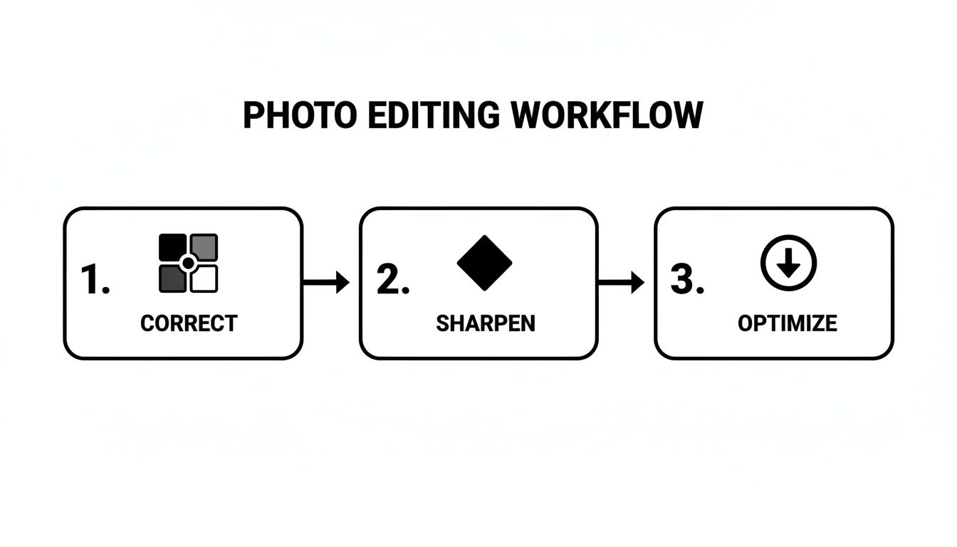
This Correct, Sharpen, Optimize sequence guarantees your visuals are clear, accurate, and ready to perform.
Stop leaving money on the table with generic, placeholder images. A deliberate, conversion-focused visual strategy is how you dominate your niche on Amazon. Your images are your most powerful sales tool—use them as such.
If you're ready to implement this research-driven approach, you can get a complete set of conversion-focused images built on this exact methodology. This level of strategic detail is what separates listings that merely exist from those that consistently crush the competition.
Frequently Asked Questions
Even seasoned operators have questions when dialing in their visual strategy. Getting the details right is what separates a listing that struggles from one that owns its category. Here are the most common questions we hear about product photography for Amazon.
How Many Product Images Should I Have on My Amazon Listing?
Always use every available image slot. For most categories, that's seven. Listings with a full image stack consistently achieve higher conversion rates. You're not just showing more pictures; you're visually answering more customer questions before they're asked, which eliminates purchase friction.
Every one of your seven images needs a specific job:
- Image 1 (The Hero): Its only job is to stop the scroll and earn the click from a crowded search results page.
- Images 2-3 (Angles & Details): Show off build quality, texture, and key features. Let the customer inspect it from all sides.
- Images 4-5 (Infographics & Benefits): This is where you tackle the biggest objections found in your research. Call out the most important benefits—the why behind the features.
- Image 6 (Lifestyle & Context): Put the product in a real-world setting. Help the buyer picture it in their own life. This creates an emotional connection.
- Image 7 (Scale, Comparison, or Brand Story): Clearly show the product's size. Put it next to a competitor to highlight your advantage, or use it to reinforce brand trust.
Can I Use My Smartphone for Amazon Product Photography?
Modern smartphone cameras are powerful, but professional results are about lighting, composition, and control, not the sensor.
For your main hero image, a smartphone is almost never sufficient. Achieving the perfectly even, crisp, pure white background that Amazon demands is incredibly difficult without a professional setup. Get it wrong, and you risk listing suppression. It's not worth the gamble.
For secondary lifestyle shots, a high-end smartphone can work—if you have exceptional natural light and a solid tripod. But in a competitive niche, the subtle edge from professional shots (perfect color, controlled lighting, tack-sharp focus) provides a real, measurable conversion lift that a phone cannot replicate.
How Do I Test the Performance of New Amazon Images?
Use Amazon's built-in tool: "Manage Your Experiments" in Seller Central. It allows you to run a clean A/B split test on your main image to see which one drives a higher click-through rate and, ultimately, more sales.
When testing a new set of secondary images, the metric to watch is your unit session percentage (your conversion rate or CVR). After uploading the new images, monitor your CVR in your Business Reports for at least two full weeks to get enough data to smooth out daily fluctuations. A sustained lift in your CVR is definitive proof that your new photography is working.
For more advanced testing strategies, feel free to contact our team for advice.
At ProductShots, we build research-driven Amazon image sets designed to tackle these exact challenges, turning your listing into a high-performance conversion tool. Get your conversion-focused images in 2–3 days.