How to Optimize Amazon Listings A Visual-First Strategy
Optimizing an Amazon listing is a visual-first exercise. It’s about treating your images as your primary sales tool and your copy as the supporting argument.
This means you have to stop guesswork and start building a strategic, seven-image sequence based on deep customer and competitor research.
Images Are Your Primary Conversion Driver
Let's be blunt: most sellers get Amazon optimization completely backward. They obsess over keyword density and backend search terms, while images are treated as an afterthought—just a box to be checked.
This is a catastrophic mistake. Your images are not decorations; they are the single most powerful conversion lever you control.
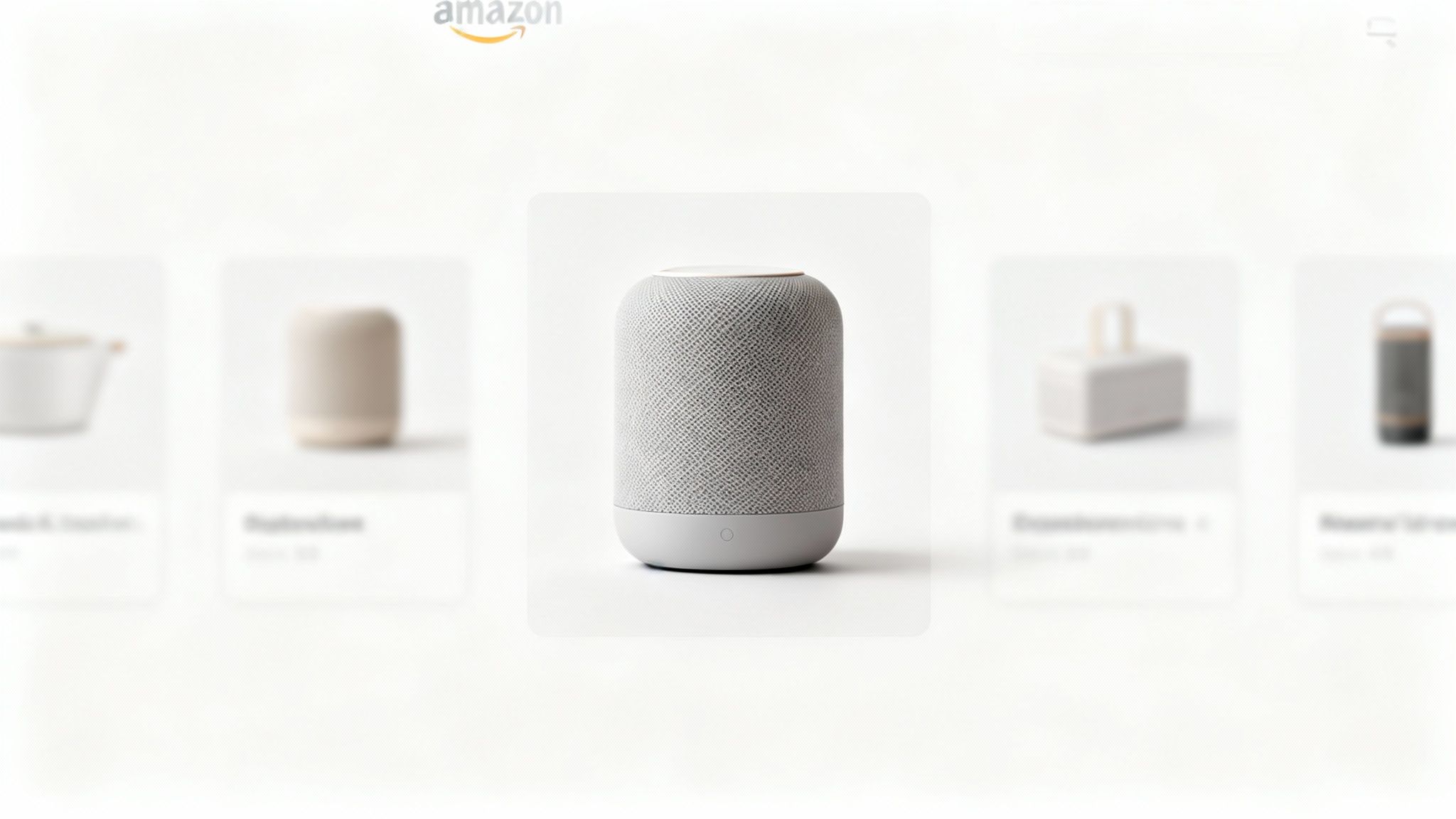
On a crowded search results page, your main image determines your click-through rate (CTR) in milliseconds. Before a shopper ever reads your meticulously crafted title or bullet points, they’ve already judged your product based on that hero shot.
A weak main image makes your PPC campaigns painfully inefficient, sending expensive traffic to a listing that simply won't convert. Images sell first, copy sells second.
The Financial Impact of Strategic Imagery
Strong images are a force multiplier for every other optimization effort you make. They improve PPC efficiency, organic ranking, and even price tolerance.
- Improved CTR: A compelling hero image stands out from the noise, attracting more clicks and lowering your Advertising Cost of Sale (ACoS).
- Higher Conversion Rate (CVR): A full image stack that answers questions and handles objections before they're even asked builds trust, turning casual browsers into actual buyers.
- Increased Sales Velocity: Better CTR and CVR lead to more sales. This is a primary signal Amazon’s algorithm uses to boost your organic ranking.
Your images are your silent salesperson. They work 24/7 to communicate value, prove quality, and build trust. They do all the heavy lifting before a customer reads a single word of your copy.
To understand this, look up What Is Visual Merchandising in Retail and How Does It Drive Sales. The same principles apply on Amazon. This isn't about making things look "pretty"—it's about deploying a calculated visual argument that sells.
The Data Behind Visual Optimization
The best sellers don't guess; they use data to inform every photo. In an environment where a shopper’s attention is captured in under 0.3 seconds, high-quality images aren't just a nice-to-have; they're the entire game.
We’ve seen it firsthand. A yoga mat listing we optimized with nine strategic images—including lifestyle shots and infographics calling out key features—achieved a 156% increase in conversion rate. It also jumped from page 3 to page 1 for its most important search terms.
This isn't an anomaly; it's the direct result of a deliberate, research-driven approach.
Most sellers make the mistake of designing images based on personal preference. This is where things go wrong. Instead of a vague creative brief, smart sellers use deep research to build a visual narrative that mirrors what their customers are already thinking.
Common Image Mistakes vs. Strategic Alternatives
| Common Mistake | Why It Fails | Strategic Alternative |
|---|---|---|
| Showing the product from different angles | Doesn't communicate value or solve a problem. It's just a 3D view. | Show the product in a real-life context, solving the customer's specific problem. |
| Overloading infographics with text | Mobile shoppers won't zoom in to read a novel. They'll just scroll past. | Use one powerful icon and a short headline to convey a single, compelling benefit. |
| Using generic stock photos for lifestyle shots | Looks cheap, inauthentic, and breaks trust instantly. | Commission custom photography showing your target demographic genuinely benefiting from the product. |
| Designing for a desktop screen | 80% of Amazon traffic is mobile. Tiny text and complex visuals become unreadable. | Design every image with a "mobile-first" mindset. Keep it clean, bold, and instantly understandable on a small screen. |
The takeaway is simple: stop treating your images like decorations and start treating them like strategic assets. By understanding what drives purchase decisions in your category, you can commission research-driven Amazon listing images that are engineered to convert.
Conducting a Pre-Design Visual Intelligence Audit
Stop guessing what images will convert. The most successful Amazon listings are built on a bedrock of customer data, not a photographer’s creative whims.
Before you create a shot list, you must run a Visual Intelligence Audit. This is the non-negotiable research that turns image creation from an art project into a targeted, conversion-driving science. The goal is to ensure every single photo and infographic has a clear, data-backed job to do—whether that's showing scale, proving durability, or crushing a common buyer objection.
Mine Customer Reviews for Visual Gold
Your competitors' reviews are a goldmine of unfiltered customer feedback. This is where you find the exact pain points, desired benefits, and nagging questions your images absolutely must address. Stop skimming for star ratings and start hunting for recurring phrases.
What questions keep popping up in the Q&A section? Those are blinking red lights signaling massive information gaps in your competitor's listing—gaps your images are about to fill.
- Look for size complaints: Phrases like "smaller than I expected" are direct orders from the market. You now know you need a scale shot or a dimensions infographic.
- Spot unexpected uses: Are customers using the product in ways the brand never intended? That’s a unique lifestyle image waiting to happen, one that speaks directly to a proven, high-intent audience.
- Pinpoint durability fears: If reviews are littered with worries about it "breaking easily" or questions about material quality, your images have to visually prove the product is tough.
- Uncover feature confusion: When buyers say, "I couldn't figure out how to…" it’s a clear sign you need an image that demonstrates that specific function in a simple, visual way.
This process gives you a checklist of real problems to solve and benefits to highlight. You're letting the market write your creative brief for you, which kills the guesswork that leads to expensive, ineffective photoshoots.
Analyze Top Competitors to Define Table Stakes
Once you know what shoppers care about, analyze the top three to five best-selling listings for your main keyword. This isn’t about copying them. It’s about establishing the visual "table stakes"—the bare minimum standard customers now expect in your category.
Do they all have a 360-degree video? Do they all feature a comparison chart? These things aren't special anymore; they're the baseline. Launching without them puts you at an immediate disadvantage.
The goal is to identify the common visual language of your niche and then find a strategic way to say something more compelling. If every competitor shows the product in a sterile studio setting, your opportunity might be a rich, aspirational lifestyle shot that connects on an emotional level.
More importantly, this analysis reveals strategic gaps. If nobody is clearly showing their packaging and yours is premium and gift-worthy, that's a powerful visual differentiator you can own. If your competitors only use text to describe a key feature, a sharp infographic makes your listing instantly more scannable and persuasive.
Synthesize Data into an Actionable Shot List
The final step is to merge these two streams of research—customer pain points and competitor weaknesses—into a concrete plan. This is your seven-image shot list, where every single image has a specific, conversion-focused purpose.
Instead of a generic list like "product on white," your shot list becomes a strategic weapon:
- Hero Image: Clean, professional shot that passes Amazon's TOS and is built to maximize click-through rate.
- Scale Infographic: Directly address the "smaller than expected" complaints you found in competitor reviews with clear dimensions.
- Durability Proof Shot: Show the product under stress to shut down those "breaks easily" fears.
- Aspirational Lifestyle: Target the "unexpected use case" you discovered (e.g., nurses using a foot roller after a long shift).
- Comparison Chart: Exploit the gap left by competitors who don’t compare their product to others. Make the choice obvious.
- Feature Callout: Visually explain that confusing feature everyone was asking about in the Q&A section.
- Brand Story Image: Reinforce your unique value proposition and build trust.
This research-driven process ensures your photography budget produces assets engineered to increase conversions, not just fill empty space. For a deeper dive, learn how visual strategy impacts Amazon performance on our blog. This audit is the foundation of a visual-first optimization strategy that works.
Engineering Your Seven-Image Conversion Sequence
Forget the idea of a "product gallery." Your seven image slots are a visual sales pitch. Each image has a specific job, designed to walk a shopper from mild curiosity to a confident "Add to Cart." It’s a strategic narrative, not a collection of random product shots.
The goal here is to answer every question and kill every objection before the customer thinks about scrolling to your bullet points. Most sellers get this wrong. They just throw up a few different angles of their product, and this unforced error crushes their conversion rates.
Let's break down how to build this visual argument, one image at a time.
Image 1: The Scroll-Stopping Hero
This one's got a single job: earn the click.
Your hero image is fighting for attention on a crowded search results page. It must instantly communicate what the product is and look professional enough to signal quality. This is your single biggest lever for improving click-through rate (CTR), which in turn feeds your ad efficiency and organic rank.
Getting this wrong is fatal. A low-res shot, an image that makes your product look tiny, or one that violates Amazon's pure-white-background rules will get you ignored or, worse, suppressed. Your hero needs to be crisp, clear, and fill at least 85% of the frame to pop on a small mobile screen.
Image 2: The Value Proposition Infographic
Okay, you got the click. Now what?
Your second image has to immediately answer, "Why should I care?" This isn't a list of features; it's your single most compelling benefit, presented visually.
If you're selling a portable blender, the benefit isn't the blade speed. It's "Make a smoothie in 30 seconds, anywhere." This image needs a strong headline and a clean visual to drive that one point home. Overloading it with text is a classic mistake—shoppers on their phones are not going to pinch and zoom to read a paragraph.
Image 3: The Aspirational Lifestyle Shot
This is where you make an emotional connection. A powerful lifestyle image shows the product in its ideal context, helping the customer see a better version of themselves. You're not just showing the product in use; you're selling the outcome.
For a high-end yoga mat, this isn't just a picture of someone doing yoga. It’s an image that creates a feeling of calm, focus, and escape. The most common failure here is using generic stock photos or inauthentic models that just scream "fake" and shatter trust instantly. This shot has to feel real and aspirational to the specific customer you identified in your visual audit.
The entire process of figuring out what to show in your images is driven by a simple, data-first workflow.
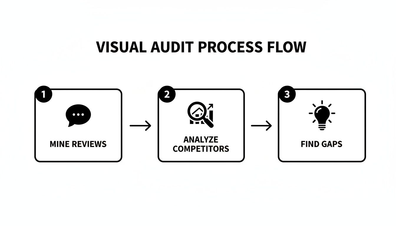
This research ensures every image you create is based on what customers actually care about, not what you think they care about.
Image 4: The Key Feature Callout
Now you can get a little more technical, but the rule is the same: show, don't tell. Pick one or two features that truly set you apart and demonstrate them with absolute clarity. Use callouts, arrows, or tight close-ups to highlight what makes your product better.
Is it waterproof? Show it underwater. Does it have a unique locking mechanism? Give me a close-up of it in action. Avoid just listing the feature in text. Proving it visually builds confidence and helps justify your price.
Image 5: The Objection-Handling Image
Your review research should have uncovered the biggest points of hesitation for your product type. This image's only purpose is to smash the most common one.
- Size Confusion: If people often complain "it was smaller than I thought," this image needs to show your product next to a universally recognized object (like a phone or a coffee mug) or have clear dimensions overlaid.
- Durability Doubts: If buyers worry it's flimsy, this image has to show the product under stress or highlight the tough materials it's made from.
- Complex Setup: If assembly is a pain point, use a simple three-step diagram to show how easy it is.
Answering a major objection before a shopper even has to ask is one of the most powerful conversion drivers there is. It proves you understand their concerns.
Image 6: The Comparison and Social Proof Shot
Make the choice easy for the customer. This image should be a dead-simple comparison chart showing how your product beats the generic competition on the 2-3 features that matter most. Don't list ten things; focus only on your key differentiators.
You can supercharge this by adding a layer of social proof. Icons like "Over 10,000 Sold" or a short, powerful snippet from a five-star review helps a buyer rationalize their decision. It gives them the logical proof they need to back up their emotional want. To learn how strategic images are designed by our team here, see our process.
Image 7: The Brand Story Closer
This is your closing argument. It’s your last chance to build a connection that goes beyond the product itself. This could be an image that showcases your brand’s mission, highlights that you're a small family-owned business, or calls out a key guarantee like "Made in the USA" or a lifetime warranty.
This final image doesn't sell a feature; it sells confidence. It reassures the customer they are buying from a real brand that stands behind what it sells. It's the final handshake that seals the deal.
Aligning Copy and A+ Content with Your Visuals
Once your visual strategy is locked in, the words on the page need to get in line.
Too many sellers treat their copy and images as two separate projects. The result? A disjointed, confusing listing that bleeds conversions. Your copy isn't the main event; it's a supporting actor to your visual sales pitch.
The goal is a seamless experience where every element works together to drive the sale. Your images make the big claims, and your text provides the proof and emotional resonance. If image four is an infographic proving your product is waterproof, your fourth bullet point should echo that benefit directly.
This synchronized approach turns your listing into a powerful, cohesive argument that pulls the customer confidently toward that "Add to Cart" button.
Weaving Your Visual Story into Your Copy
Your title and bullet points are not just places to stuff keywords. They must work in tandem with your images, pulling the core messages from your visual sequence and translating them into benefit-driven text.
One of the most common mistakes is a title packed with technical specs while the hero image tries to sell an emotion. It creates an immediate disconnect. Your title should be the headline for your hero image, combining your top keyword with the primary benefit shown.
- Hero Image: A crisp shot of a premium leather wallet.
- Weak Title: "Men's Wallet RFID Blocking Bifold 12 Card Slots Genuine Leather"
- Strong Title: "The Commander Wallet by Sentinel - Full-Grain Leather RFID Wallet for the Modern Minimalist"
The second title works with the image. It builds a brand and sells an ideal, not just a list of parts. This synergy is what earns the click from a crowded search results page.
Writing Bullet Points That Echo Your Infographics
Think of your bullet points as the script for your infographic and feature-callout images. Each bullet should directly correspond to a specific visual, expanding on the claim made in the photo. It’s a powerful one-two punch of "show and tell."
Let's say your third image is an infographic showing off a durable, no-scratch material. Your third bullet point needs to lead with that benefit.
Bullet Point Example:
ULTIMATE SCRATCH-RESISTANCE FOR PEACE OF MIND: Stop worrying about daily wear and tear. As shown in our stress-test image, our proprietary composite material resists keys, drops, and abrasions, keeping your device looking pristine day after day.
This approach nails three critical things at once:
- It reinforces the visual claim with benefit-driven language.
- It preemptively answers a customer objection about durability.
- It naturally weaves in relevant long-tail keywords.
This is a fundamental technique for how to optimize Amazon listings that most sellers miss. Your copy and images must tell the same story.
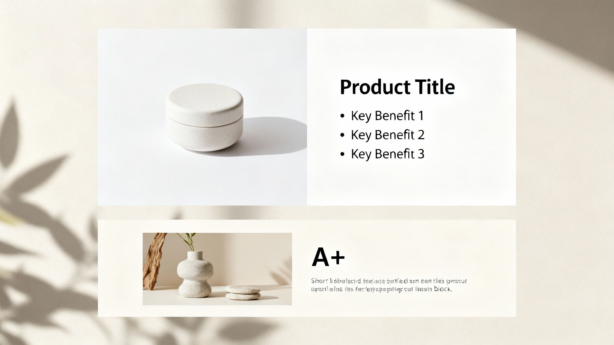
Leveraging A+ Content to Close the Sale
Your main images and bullets handle the core sales pitch. A+ Content is where you close the deal.
This is your chance to expand on your visual story, handle complex information, and cement your brand's authority. Use A+ modules to give your most important visuals more room to breathe.
Got a powerful lifestyle shot? Use a full-width A+ module to showcase it, pairing it with copy that reinforces that aspirational feeling. Have a comparison chart in your main images? Create a more detailed, data-heavy version in your A+ Content to definitively prove your product is the superior choice.
The key is to maintain the narrative. A+ Content shouldn't introduce some random new idea. It should be the final chapter of the story you started with your hero image, removing all remaining doubt and making the purchase feel like the only logical next step.
Measuring and Iterating Your Image Strategy
Getting your new visuals live isn't the finish line; it’s the starting pistol for the validation phase. You’ve just made a data-backed hypothesis about what will drive sales. Now, it's time to see if you were right.
Too many sellers upload new photos, see a small sales bump, and move on. This is a massive mistake. Without a clear measurement framework, you have no real idea if that lift came from your images, an ad spend fluctuation, or seasonal demand. You have to isolate the variable to learn what works.
Optimization is never a one-and-done deal. It's a constant loop of testing, measuring, and refining. This is how you stay ahead of competitors and adapt as shopper expectations change.
Key Metrics to Track Before and After
To understand the impact of your new image stack, you need a clean baseline. Pull a report from Seller Central's Business Reports for the 30 days before your images went live.
Then, track these same metrics for the 30 days after the change.
- Unit Session Percentage (Conversion Rate): This is your north star. It answers the simple question: "Did a higher percentage of people who visited my listing actually buy?" A solid lift here is the clearest signal your new images are successfully crushing objections and building buyer confidence.
- Click-Through Rate (CTR): Pulled from your advertising reports, this metric is almost entirely influenced by your main image. If your CTR goes up, it means your new hero is doing a better job of grabbing attention and winning the click from the search results page.
- Add-to-Cart Data: This is a powerful leading indicator of purchase intent. Even if your conversion rate stays flat for a bit, a noticeable increase in add-to-carts suggests your new visuals are far more compelling and are effectively moving shoppers down the funnel.
Using Amazon Experiments to Find Empirical Winners
When it comes to your most valuable visual asset—the hero image—never guess.
Amazon’s ‘Manage Your Experiments’ tool is built for this. It lets you run a direct A/B split test, serving two different main images to shoppers and declaring a statistical winner based on hard data: units sold, conversion rate, and total sales.
This is the only way to get undeniable proof of what actually works. Let these tests run for at least four weeks to smooth out fluctuations in traffic or buying behavior. Even a seemingly small 5-10% improvement in CTR or conversion rate can have an outsized impact on your ranking and profitability over time. Rigorous A/B testing for content optimization is non-negotiable for effective optimization.
Establishing a Qualitative Feedback Loop
The numbers tell you what happened. Your customers will tell you why.
Once your new images are live, start paying obsessive attention to the new questions and reviews rolling in.
If you did your homework during the pre-design audit, you should see a significant drop in questions about the specific pain points your new images were designed to solve. That's your validation. It proves the visual strategy is working.
On the flip side, if a new, unexpected question starts popping up over and over, that’s your cue for the next iteration. It highlights a fresh information gap your current image stack isn't addressing.
This creates a repeatable system for constant improvement. We saw one listing achieve a 156% conversion growth in just 60 days by using this loop to methodically address buyer objections with new infographics and lifestyle proof.
The Uncomfortable Truth About Amazon Success
Let’s be blunt. You can burn the midnight oil on keyword research and obsess over every last PPC bid, but if your images don't convert, you're just paying to send traffic to a leaky bucket.
Success on Amazon isn't about some secret hack. It's about executing the fundamentals better than everyone else in your category. And that execution starts and ends with your visuals—a research-driven strategy that answers customer questions before they even think to ask them.
Your image block is the single highest-leverage asset you have. Period. It influences your click-through rates, your conversion, and ultimately, your rank. Every other optimization you make is either amplified or nullified by how well your images sell the product.
Stop treating your images as a simple checklist item. They are not an administrative task to be outsourced to the lowest bidder. They are the absolute core of your conversion engine.
The question isn't whether you can afford to invest in a strategic, data-driven image sequence. The real question is whether you can afford not to.
Common Questions from Sellers
Here are a few of the most common questions we hear from brands getting serious about conversion.
How Often Should I Update My Amazon Listing Images?
Don't think in terms of a calendar. Think in terms of performance.
A big refresh is a must if your conversion rate starts to tank, a new competitor shows up with killer visuals, or your customer reviews are pointing out a problem your images aren't solving.
At the very least, you should be split-testing a new main image every quarter. This is a simple way to fight ad fatigue in your PPC campaigns and often uncovers easy wins in your click-through rate. Your images aren't a one-and-done task; they're a living asset you constantly refine.
Are Lifestyle Photos or Infographics Better?
That's the wrong question. It's not an either/or scenario—an effective listing needs both, working together.
Lifestyle photos create an emotional pull. They show your product solving a real problem in a context the shopper immediately understands. Infographics are all about clarity, quickly communicating technical specs, dimensions, and key benefits without any fluff.
Your pre-design research should tell you what the right mix is. If reviews constantly bring up confusion about your product’s size, a clear infographic with dimensions is non-negotiable. If buyers are chasing a feeling (like the sense of calm from a new yoga mat), a powerful lifestyle shot will do the heavy lifting.
Can Better Images Justify a Higher Price?
Absolutely. In fact, it's one of their primary jobs. Strategic images directly boost the perceived value of your product, which gives you the confidence and the evidence to command a higher price. When your visuals scream quality, premium materials, and smart design, shoppers are more willing to pay for it.
Weak images make a great product feel cheap, dragging you into a price war you can't win. Strong images build trust and set you apart from low-cost knockoffs, letting you charge what you're worth.
Investing in professional photography and sharp, benefit-focused infographics is an investment in your brand's position. It's often the single reason a shopper clicks "Add to Cart" on your $40 product instead of the nearly identical $30 one sitting right next to it. To build that kind of visual authority, you can explore our research-driven image creation process and see exactly how we build conversion-focused assets.