Amazon Lifestyle and Infographic Images: The Complete Playbook
March 15, 2026

Stop Guessing: A Strategic Guide to Amazon Lifestyle Images That Convert
If your Amazon images are an afterthought, you're not just missing an opportunity—you're actively burning cash. For experienced sellers, product images are the single most powerful sales tool on the platform. They are what stop the scroll, earn the click, and drive the add-to-cart. Copy sells second.
Why Your Product Images Are Quietly Killing Your Sales
Your Amazon images aren't a creative project. They’re a financial lever. Weak, uninspired, or generic images tank every metric that matters. They are the primary reason a customer clicks on a competitor’s listing instead of yours.
This isn’t theory. A low click-through rate (CTR) tells Amazon’s algorithm your listing is irrelevant, slowly poisoning your organic rank. For your ad campaigns, the damage is faster: a low CTR on your main image means you pay more for every click, your ACoS balloons, and your budget evaporates with nothing to show for it.
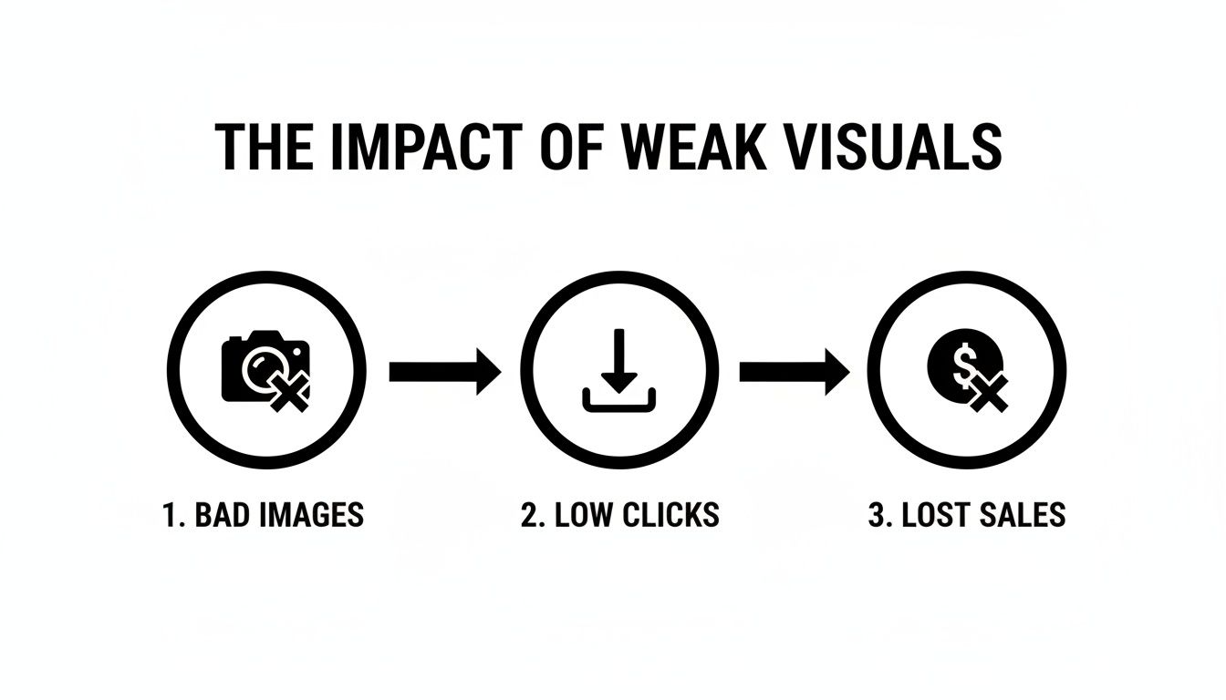
The Real Cost of Bad Visuals
The fallout from poor imagery goes beyond aesthetics. It sets off a domino effect that crushes your profitability and hands sales to your competition.
- Zero Click-Through Rate (CTR): Your main image is your digital storefront. If it doesn't grab attention and communicate value in under 3 seconds, shoppers scroll right past. You lose the sale before they even see your page.
- Sky-High ACoS: When your images don't get clicks, your PPC campaigns become a money pit. You're paying for impressions that never turn into page views, forcing you to bid higher just to get noticed. Weak images are a direct cause of inefficient ad spend.
- Poor Conversion Rates (CVR): Once a shopper lands on your page, your secondary images have one job: answer questions and build desire. If they fail, the shopper bounces. Lifestyle images are critical here; they bridge the gap between seeing a product and needing to own it.
- No Pricing Power: Premium images signal premium value, allowing you to command a higher price. Bad images do the opposite. They make you look cheap, forcing you into a price war you can't win.
On Amazon, images sell first. Copy sells second. A shopper who isn't sold by your images will never even get to your bullet points or A+ Content.
On Amazon, images sell first. Copy sells second. A shopper who isn't sold by your images will never even get to your bullet points or A+ Content.
Treating your image stack like a simple box to check is the most common—and costly—mistake sellers make. The goal isn't just to show the product. It’s to build a visual sales pitch that takes a customer from curious to converted without friction.
A Strategic Framework for High-Converting Lifestyle Images
Stop guessing. Effective Amazon lifestyle images aren't born from creative brainstorming. They're the end result of a deliberate, research-driven process.
The old advice to "show your product in use" is lazy and incomplete. A truly strategic image set works as a silent salesperson, building a visual argument that leads shoppers to one conclusion: Add to Cart. That argument must be built on a rock-solid foundation of data before you ever touch a camera.
This framework is about pre-production intelligence. It’s about ensuring every single image has a specific, conversion-focused job. The goal isn't just to have generic lifestyle shots; it's to architect a visual story that smashes objections, builds desire, and walks the shopper straight to the checkout.
Mine Reviews for Visual Gold
Your first stop isn't a mood board. It's your own reviews—and, more importantly, your top competitors' reviews. This is where customers tell you exactly what matters to them, what they found confusing, and what ultimate benefit they were really after.
Skip the generic five-star "love this!" comments. The real gold is in the two, three, and four-star reviews. They contain the exact words and scenarios you need to address visually.
- Pain Points: Look for phrases like "I wish it had..." or "it was smaller than I expected." If a customer complains a travel mug doesn't fit their car's cupholder, your lifestyle shot must show it fitting perfectly in one.
- Desired Outcomes: When a buyer says, "it helped me finally organize my chaotic garage," they're not just buying shelves. They're buying peace of mind. Your lifestyle image must sell that "after" state—the clean, organized garage, not just a picture of the product.
- Misconceptions: If reviews mention confusion about assembly or how a feature works, that's your cue. You need a lifestyle image or a hybrid infographic that shows that process with absolute clarity.
Ignoring this research has a direct financial cost. Using weak, unplanned visuals is a guaranteed way to lose clicks and leak sales.
This is the reality for thousands of sellers. Poorly planned images don't just fail to help; they actively kill your clicks and revenue, making every other investment (like PPC) less effective.
Deconstruct Competitor Visuals
Next, analyze the top 5-10 listings for your main keyword. Don't just glance at what they're doing—break down why they're doing it.
Open a simple spreadsheet and map out the strategic role of each of their image slots. What objections are they handling? What benefits are they highlighting? What emotions are they trying to trigger with their models and locations?
You'll spot patterns fast. These patterns reveal the core purchase drivers and major hesitations in your specific niche. Your job is to meet those baseline expectations and then beat them with clearer, more persuasive visuals.
Create Your Visual Messaging Hierarchy
With your research complete, build your Visual Messaging Hierarchy. This is your battle plan. It assigns a specific job to each of your secondary images, ensuring they work together as one cohesive sales pitch. Each image builds on the last, systematically answering questions and building value.
The table below breaks down how each image slot can be assigned a strategic objective, moving the shopper from initial attraction to final purchase justification.
Visual Messaging Hierarchy Breakdown
This structured approach takes the guesswork out of the process. It turns your image set from a random collection of photos into a high-performance asset engineered for one thing: getting the sale.
For a deeper look at image planning, see our guide on listing images that convert and our Amazon product photography guide for the research-driven approach behind every shot.
Executing the Perfect Amazon Lifestyle Photoshoot
You've done the research. You have your Visual Messaging Hierarchy. Now comes execution. A brilliant strategy means nothing if the final images look cheap, fake, or miss the point entirely.
This isn't about snapping pretty pictures. It's about manufacturing authenticity and producing assets that sell.

The single biggest mistake sellers make is creating images that look like generic stock photos. Overly perfect models with plastic smiles in sterile rooms just scream "advertisement." Trust evaporates instantly. Your goal is to create a scene a shopper can see themselves in.
Art Direction That Converts
Art direction is making deliberate choices that serve your strategy. It starts with two things: models and environments. Get these wrong, and the entire narrative falls apart.
Your models shouldn’t just fit a demographic. They need to embody your customer’s aspirations. Selling a high-end yoga mat? Don't just find a woman aged 25-40. Find someone who radiates calm focus and strength—the person your buyer wants to become.
The environment is just as critical. It’s the stage. Selling a rugged outdoor backpack? Shooting it on a white background is a waste. Shooting it on a muddy trail next to a campfire tells an instant story. Adventure. Reliability. Done.
- Models: Pick talent that looks like a real, aspirational version of your customer. Avoid polished "catalog" models.
- Environments: The location must feel authentic to the product's use case. A real kitchen. A messy workshop. A real trail.
- Props & Styling: Use props that add to the story, not distract from it. Every item in the frame needs to feel like it belongs there. No clutter.
Mobile-First Composition Techniques
Most of your customers see your images on a tiny screen while scrolling. Your composition must be built for that reality -- our guide to Amazon mobile image optimization covers the technical details. A busy, complex shot just turns into a visual mess.
You need a clear focal point. The shopper's eye must land on your product immediately.
Your lifestyle images must be composed for a thumb-swipe, not a gallery wall. Use negative space, leading lines, and tight framing to make your product the undeniable hero of the shot, even on a 5-inch screen.
Your lifestyle images must be composed for a thumb-swipe, not a gallery wall. Use negative space, leading lines, and tight framing to make your product the undeniable hero of the shot, even on a 5-inch screen.
Think about the visual hierarchy inside the photo itself. Arrange elements to guide the eye straight to your product solving the problem. A shallow depth of field, for example, is a powerful tool. It blurs the background and makes the product pop right off the screen.
Lighting is your best friend here. Don't settle for flat, boring light. Use directional light to create shape, depth, and mood. Good lighting makes a product feel premium. Bad lighting makes even the best product look cheap. For a deeper dive, check out this guide to product photography for Amazon that converts.
Avoiding the "Stock Photo" Trap
Authenticity is the currency of conversion. The second a shopper sniffs out a generic, staged photo, their guard goes up. Your lifestyle shots must feel like a snapshot from a real person's life.
Here's how to do it:
- Imperfect Action: Capture real moments. Shoot the laugh after the joke, not a posed smile. Show the product mid-use, not perfectly placed.
- Relatable Wardrobe: Dress models in clothes your actual customers wear. High-fashion or branded outfits can feel totally out of touch.
- Natural Posing: Give scenarios, not poses. Say, "Show me how you'd relax after a long day," not "Put your hand here and smile at the camera."
Ultimately, the perfect photoshoot is about turning your data-driven plan into persuasive images. If you did the research, you already have the roadmap.
Designing Infographics That Actually Convert
A pure lifestyle shot sells the dream. An infographic proves the value.
While aspirational amazon lifestyle images for listings get shoppers to feel an emotional connection, infographics are your closers. They are the workhorses of your image stack, built to deliver hard facts and dismantle purchase barriers with brutal efficiency.
The biggest mistake sellers make is cramming every feature onto a single, cluttered image. That’s just visual noise. An effective infographic doesn’t list features; it proves benefits.
Its only job is to pass the 'flashcard test'—can a distracted shopper, scrolling on their phone, instantly absorb the core message? If the answer is no, it has failed.
Translate Features into Benefits
Shoppers don't buy features; they buy outcomes. Your infographic's primary job is to bridge that gap. This is a non-negotiable step that separates amateur sellers from professional operators.
Your review mining should have already told you what benefits matter most. Instead of stating a technical spec, you must translate it into a tangible result for the customer.
- Weak Feature: "Durable Material"
Powerful Benefit: "Built to Withstand Daily Drops & Abuse"
- Powerful Benefit: "Built to Withstand Daily Drops & Abuse"
- Weak Feature: "5000 mAh Battery"
Powerful Benefit: "All-Day Power for Work & Travel"
- Powerful Benefit: "All-Day Power for Work & Travel"
- Weak Feature: "Waterproof IP68"
Powerful Benefit: "Worry-Free Use at the Beach or Pool"
- Powerful Benefit: "Worry-Free Use at the Beach or Pool"
This isn't just about wording. It's a fundamental shift in communication. You're moving from talking about your product to talking about your customer's life. That simple change directly addresses their subconscious questions and builds real purchase confidence.
Design Principles for High-Converting Infographics
Clarity trumps creativity every single time. An infographic that wins design awards but loses sales is a failure. The design must serve one purpose: make your message as clear and digestible as humanly possible, especially on a small mobile screen.
Every design element—font, color, icon, and placement—must fight for clarity. If an element doesn't make the core message easier to understand in under three seconds, get rid of it.
Every design element—font, color, icon, and placement—must fight for clarity. If an element doesn't make the core message easier to understand in under three seconds, get rid of it.
Follow these blunt design rules:
- Strict Visual Hierarchy: The most important benefit gets the most visual weight. Use a larger font or a brighter color to draw the eye to your number-one value proposition immediately.
- High-Contrast Text: Your text overlay must be instantly readable. White text on a busy, light-colored background is a common and costly mistake. Use dark overlays, drop shadows, or solid color blocks to ensure your text pops.
- Clean & Simple Fonts: Stick to bold, sans-serif fonts like Helvetica, Lato, or Montserrat. Avoid decorative or script fonts that are impossible to scan quickly. Legibility is the only goal here.
- One Core Idea Per Image: Don't cram three or four benefits into one infographic. Dedicate one image to showcasing dimensions, another to highlighting a key material, and a third to explaining a unique function. Focus equals clarity.
An effective infographic is a hybrid asset. It pairs the aspirational context of a lifestyle image with the hard-hitting data of a spec sheet. By layering benefit-driven text over a compelling visual, you create a powerful tool that answers questions before they're even asked—and pushes the shopper one step closer to the add-to-cart button.
Navigating Amazon's Technical Image Requirements
Your creative strategy means nothing if your images get suppressed. A brilliant set of amazon lifestyle images for listings is worthless if you trip over Amazon's rigid, non-negotiable technical rules.
Getting this wrong isn't about aesthetics—it's about getting your listing yanked from search, killing your sales instantly. Compliance is now a make-or-break factor for visibility.
For a deeper dive into the latest suppression triggers, check out the analysis on Amazon's image policies at weshop.ai.
The Main Image Non-Negotiables
Your main image, your hero shot, is the most heavily policed asset on your entire listing. Amazon’s bots enforce these rules automatically. There is zero room for error.
- Pure White Background: This is mandatory. Not off-white. Not light grey. It must be pure digital white, RGB (255, 255, 255).
- Product Only: The image must show only the product you are selling. No props, no text callouts, no logos, no watermarks. Period.
- 85% Frame Coverage: The product itself must fill at least 85% of the image canvas. This ensures it’s large and clear in tiny mobile search results.
Deviate from these three rules, and you have found the fastest way to get your product suppressed. The fallout is immediate: zero visibility, zero traffic, and zero sales until you fix it.
Technical Specs for All Listing Images
Beyond the main image, all your visuals—your lifestyle shots, your infographics—have to meet a technical baseline. These are requirements for a functional, high-converting listing.
Think of pixel dimensions as your ticket to earning trust. Images below 1600 pixels on the longest side kill the zoom function. This is a critical failure. Shoppers who can't inspect your product up close are far less likely to buy.
Think of pixel dimensions as your ticket to earning trust. Images below 1600 pixels on the longest side kill the zoom function. This is a critical failure. Shoppers who can't inspect your product up close are far less likely to buy.
Here are the specs you must nail every single time:
- Pixel Dimensions: 1000 pixels on the longest side is the absolute minimum. The professional standard is 1600 pixels or more to give shoppers a smooth zoom experience. We aim for 2000x2000 pixels for maximum quality.
- File Formats: Amazon accepts JPEG, TIFF, PNG, and GIF. Stick with JPEG (.jpg). It provides the best balance of image quality and file size, which helps your page load faster.
- Color Mode: Always save your images in sRGB color mode. If you use something else like CMYK, Amazon's system will process it incorrectly, and your product colors will look completely wrong to shoppers.
Failing here creates a terrible customer experience. Blurry images, disabled zoom, and weird colors don't just kill conversions—they actively drive up returns.
Compliance is the foundation. Without it, your entire listing is dead in the water.
Your Images Aren't a Cost—They're Your Highest ROI Investment
Let's tie this all together. Your Amazon listing images are not just another expense on a spreadsheet. They are a force multiplier. Think of them as your best salesperson, working 24/7 on your most important sales channel, converting shoppers while you sleep.
When you build an image set on solid research and execute it with a clear strategy, you directly improve every single metric that matters to your bottom line.

The Ripple Effect on Your Performance Metrics
Weak images don't just sit there doing nothing; they actively hurt your listing. They kill conversions and signal to Amazon's algorithm that your product is a poor match for shoppers. A strategic visual overhaul creates a powerful ripple effect across your entire account.
- Boosts Click-Through Rate (CTR): Your main image is what stops the scroll in a sea of competitors. Earning that click tells Amazon your listing is relevant, which feeds back into better organic rankings over time.
- Increases Conversion Rate (CVR): Once a shopper lands on your page, your image stack takes over. It visually smashes their objections, answers their unasked questions, and builds enough desire to turn a page view into a sale.
- Justifies a Higher Price Point: Professional, high-end images scream "premium quality." This creates perceived value, giving you the power to price your product based on its worth, not just to compete in a race to the bottom.
- Improves PPC Efficiency: This is where the magic happens. Higher CTR and CVR make your ad spend radically more effective. You get more clicks for your money, and more of those clicks turn into sales. Your ACoS drops, your TACOS improves, and your profitability soars.
For more on this, you can check out insights on optimizing your Amazon listing on marknology.com.
Where Your Money Actually Works Hardest
When you look at the compounding benefits, the conclusion is obvious. Investing in a professional, research-driven image set offers one of the highest ROIs of any activity you can undertake as an Amazon seller. It's an investment that pays for itself again and again through more sales, better ad performance, and a stronger brand.
Your images are the foundation your entire Amazon strategy is built on. Strong images make good copy convert better. They make good PPC campaigns more profitable. They make a good product look incredible.
Your images are the foundation your entire Amazon strategy is built on. Strong images make good copy convert better. They make good PPC campaigns more profitable. They make a good product look incredible.
It’s time to stop trying to win on price and start winning on perception. Your images are the key. They are the single greatest lever you can pull to influence shopper behavior and drive real, bottom-line results. Start treating them like the high-performance asset they are.
For sellers ready to put this strategy into action without the headache, professional services are the fastest path to results. You can get a complete, research-driven image set from AZ Prodshots that’s designed from the ground up to systematically increase your conversion rates.
Frequently Asked Questions
Let's skip the basics. These are the practical, dollars-and-cents questions that smart sellers ask when they're serious about turning images into profit.
How Do I Measure the ROI of a Photoshoot?
Forget fuzzy feelings about "brand lift." The real ROI of your images shows up in the hard data you can pull directly from Seller Central. A strategic image refresh should move the needle on these three metrics almost immediately.
- Click-Through Rate (CTR): Your main image is responsible for this. A better hero shot stops the scroll and gets you more clicks, which you'll see as an improved Session Percentage.
- Conversion Rate (CVR): This is the job of your secondary images. When your lifestyle shots and infographics are more persuasive, your Unit Session Percentage will climb.
- PPC Performance: Higher CTR and CVR directly slash your ACoS. If your ad spend stays the same but your sales go up, your new images just paid for themselves.
The process is simple. Pull your numbers for the 30 days before you upload the new images. Then, track the same metrics for the 30 days after. The difference is your return on investment.
Should I Use Models?
Yes, you should use models. A product shown in a person’s hands is almost always more relatable and sells better than one floating on a page. Models give context for size, show the product in action, and sell the aspirational feeling your customer is after.
The biggest mistake is hiring generic stock photo models who look nothing like your actual customers. Shoppers can spot a fake a mile away. If the person in the photo doesn't feel like someone who would genuinely use and love your product, you’ll lose their trust instantly.
The biggest mistake is hiring generic stock photo models who look nothing like your actual customers. Shoppers can spot a fake a mile away. If the person in the photo doesn't feel like someone who would genuinely use and love your product, you’ll lose their trust instantly.
The goal is to find talent that reflects your ideal customer's aspirations and values, not just their surface-level demographics. This creates a believable scene that feels less like a cheap ad and more like powerful social proof.
What Is the Best Way to A/B Test Lifestyle Images?
Don't guess. The only way to know for sure what works is to use Amazon’s "Manage Your Experiments" tool. It's the definitive platform for split-testing and getting real data on what actually drives sales.
You can test one element at a time to isolate what’s working:
- Main Image: Pit your new lifestyle hero shot against your old white-background image. See which one delivers a higher CTR.
- Secondary Image: In slot #2, test a benefit-focused infographic against a pure lifestyle shot to see which one lifts your overall conversion rate.
Let your tests run for at least 4-6 weeks to get reliable data that isn't skewed by random daily fluctuations. The goal is constant improvement. A great image set today could be beaten tomorrow. Always be testing.
Stop losing sales to competitors who just have better visuals. AZ Prodshots delivers a complete set of seven research-driven, high-converting Amazon listing images designed to increase your conversion rate.
Learn more and get your high-converting images here
Ready to Upgrade Your Amazon Listing Images?
Get 7 research-driven images for your product. $400 flat fee, 2-3 day turnaround.
Get Your Images Now